Not Found
Not Found
Not Found
Not Found
Not Found
Not Found
Not Found
Not Found
Not Found
Not Found
Not Found
Not Found
Not Found
Request path contains unescaped characters
Not Found
Not Found
Not Found
Not Found
Not Found
Not Found

Submitted

Clipboard landing page

@JPbyte

Desktop design screenshot for the Clipboard landing page coding challenge

This is a solution for...

  • HTML
  • CSS
2junior
View challenge

Design comparison


SolutionDesign

Solution retrospective


#HTML #CSS #SASS/SCSS

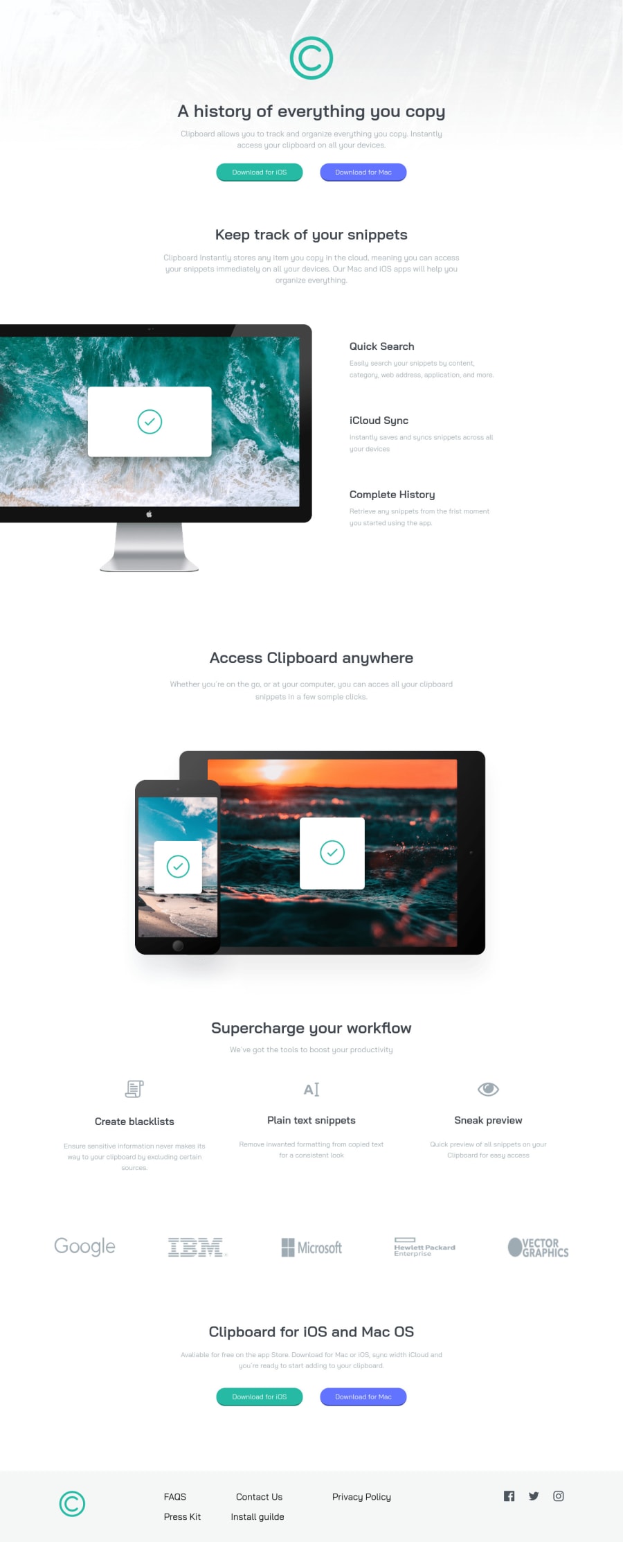
Good night, today I did another project, it took me a while, but I managed to finish it. I put the animation in, what do you think?

Community feedback

Lucas 👾 104,420

@correlucas

Posted

👾Fala João Pedro, tudo bem? Parabéns pelo desafio!

O design da sua solução ficou perfeito, mas ainda não está centralizado, tenta abrir em uma tela maior ou dar zoom out pra vc ver. Pra centralizar o todas as sections vc vai ter que delimitar o tamanho do container com max-width: 1110px e colocar margin: 0 auto pra forçar o alinhamento.

Minha dica é vc criar uma classe de container com o tamanho do container e a margem pra fazer esse alinhamento, vou te deixar o link de uma solução que eu apliquei esse conceito pra vc entender melhor: https://skilled-e-learning-landing-page-three.vercel.app/ pode ver que o header e o footer e todo resto estao alinhados, isso é devido a classe de container.

👋 Espero ter ajudado e continue no foco!

Marked as helpful

0

Elaine 11,400

@elaineleung

Posted

Hi João, well done here in this project! I think you did many thing well here; I just wasn't too clear on what you meant by "animation in the bar", but yes, I do see the animation in various places! 🙂For the animation in the buttons, I probably would make the transition duration a bit faster (shorter), just so it doesn't seem like there's a lag. That's the only comment I have about animation!

One suggestion I have is about the background image; right now I'm viewing this on a large screen, and the background image has some white space to the right because it's at its max width. You can add a background-size: cover; to the body to fix that, and the image should be able to stretch across the page afterwards!

Well done, and keep going! 😊💪‍

Marked as helpful

0

@ziy-eg

Posted

I just love your project, and I love adding the animation too:

body header img {
  width: 100px;
  margin-top: 84px;
  margin-bottom: 46px;
  -webkit-animation: flutuar 3s infinite;
   animation: flutuar 3s infinite;
}

-however, -this is just me- I like the short time animation: try using only 1s for the whole time. it would be much better.

also

-I reviewed your live site on a large screen, and I had a white space column on the right side of your header.

try this one:

header {
  background-image: url(../images/bg-header-desktop.png) no-repeat;
  background-size: cover;
  background-position: top;
  width: 100vw;
}

and for mobile devices - just change the background url;

Honestly I enjoyed your project.

0

Please log in to post a comment

Log in with GitHub
Discord logo

Join our Discord community

Join thousands of Frontend Mentor community members taking the challenges, sharing resources, helping each other, and chatting about all things front-end!

Join our Discord