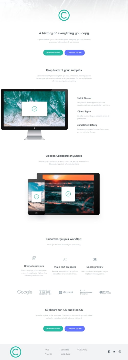
Clipboard landing page with responsive flexbox/grid

Solution retrospective
I learned quite a lot of more refined CSS techniques, such as applying a mask to a background image using pseudo-elements, the fine details of box shadows, and getting flex/grid containers to change based on media queries.
What challenges did you encounter, and how did you overcome them?Getting the overflowing image to look correct was very difficult. In the end, I have toned down the degree of overflow to something which I think looks good at most screen sizes. I achieved this by just setting a large negative margin-left on the image container. But I would be keen to hear of other ways to achieve this effect.
The other thing I couldn't really figure out was the left-aligned footer nav on the desktop design, but I also felt that a centred nav both looked better and was easier to implement, so I just used that instead.
What specific areas of your project would you like help with?Any advice on how to approach the overflowing image or the left-aligned grid footer nav would be very welcome.
I also know my CSS is a bit of a mess, so some organisational tips would also help me a lot.
Please log in to post a comment
Log in with GitHubCommunity feedback
No feedback yet. Be the first to give feedback on Neil's solution.
Join our Discord community
Join thousands of Frontend Mentor community members taking the challenges, sharing resources, helping each other, and chatting about all things front-end!
Join our Discord