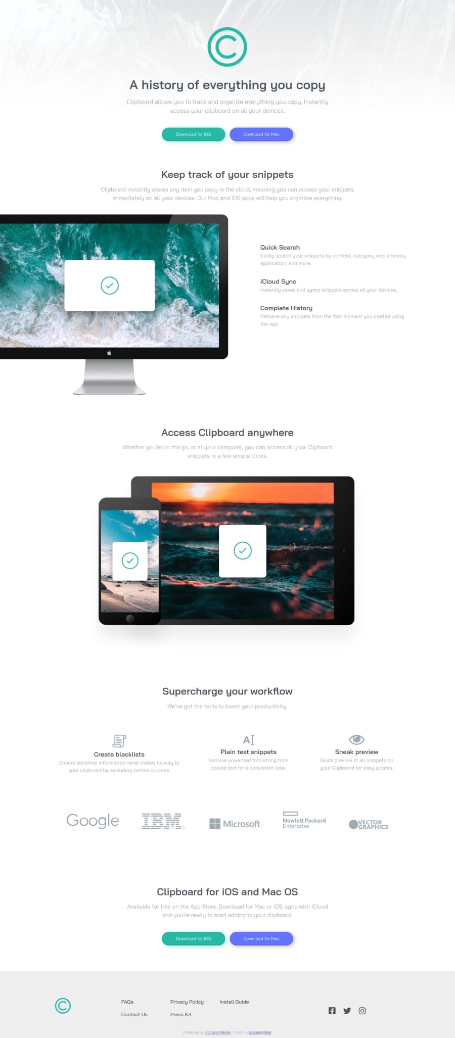
clipboard landing page with html and css
Design comparison
Solution retrospective
I'd like to know what you think!
Community feedback
- @ApplePieGiraffePosted over 4 years ago
Hey, good work on this challenge, Bumble Bee! 👍
Your solution looks great and responds rather well! 👏
I only suggest,
- Adding a little space between the "Vector Graphics" logo and the rest of the company logos above it so that there's some room between the two when the width of the page decreases.
- Adding a
max-widthto the buttons so that they aren't so wide when the layout first changes from desktop to mobile. - Adding a heading to the footer section to identify it and clear up that error on your solution report.
Keep coding (and happy coding, too)! 😁
0@blessingpetersPosted over 4 years ago@ApplePieGiraffe Thank you for your feedback
0
Please log in to post a comment
Log in with GitHubJoin our Discord community
Join thousands of Frontend Mentor community members taking the challenges, sharing resources, helping each other, and chatting about all things front-end!
Join our Discord
