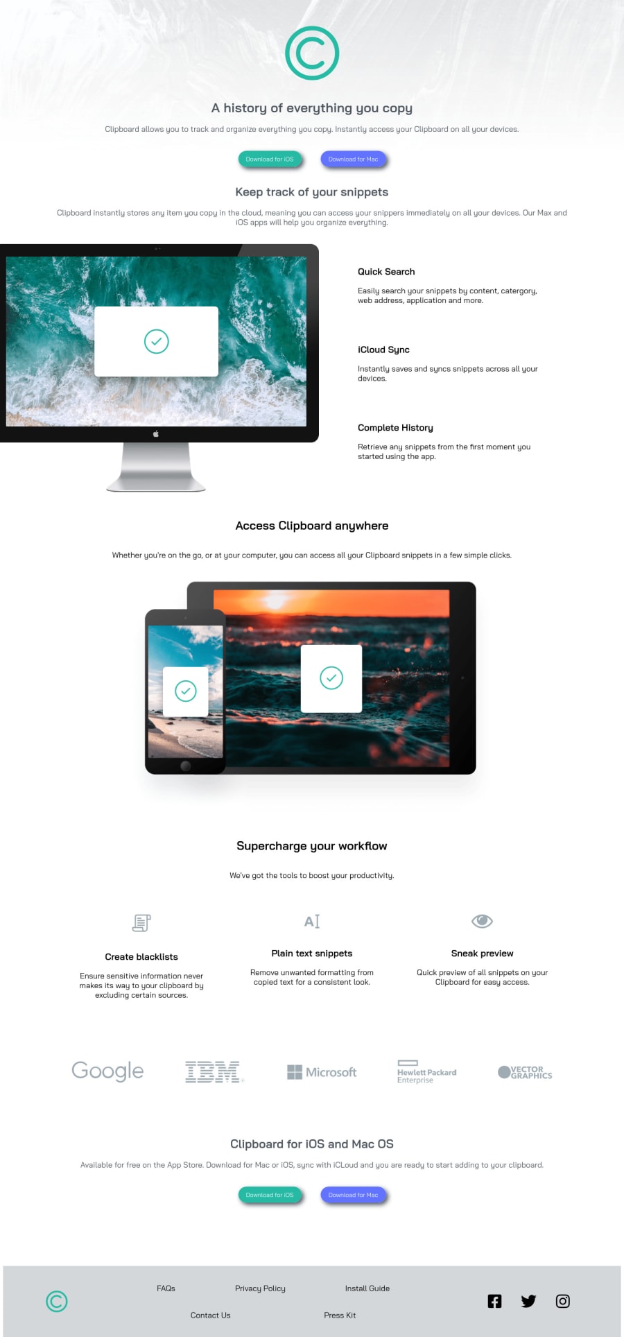
Design comparison
Solution retrospective
I tried my best to make the page responsive as possible. I think it looks good and according to the design for 375px screen as well as for 1440px screen. The only problem I had, is to align the footer items according to the design given. I created the footer elements according my personal choice. Any kind of feedback and critics are more than welcome and accepted ! :D I just want to get better at CSS
Community feedback
- @ApplePieGiraffePosted almost 4 years ago
Hi, Sibasish Sinha! 👋
Good effort on this challenge! 👍
A few things you can do to improve your solution would be,
- Adding a max-width to the main container or wrapper to prevent the content of the page from becoming too stretched on extra-large screens.
- Doing some more work on the responsiveness of the site to ensure that your solution looks good on both desktop and mobile devices and anything else in between (adding a tablet layout when things begin to look squished due to a decreased screen width in the desktop layout, for instance, would be a good idea).
- Decreasing the intensity of the box-shadow on the button elements would be a small but nice touch!
- Using
<section>tags for the various sections of the page (as long as those sections have a heading in them to identify them) would make your HTML more semantic.
Hope those tips help. 🙂
Keep coding (and happy coding, too)! 😁
1@SibasishSinhaPosted almost 4 years ago@ApplePieGiraffe Thanks a lot for all these suggestions. I will add more responsiveness to the site so that I looks good and clean for each size of the window. I feel comfortable with < div > tag, that's why I use it :D Is it a good practice to use both < section > tags as well as < div > tags ? Please suggest
1@ApplePieGiraffePosted almost 4 years ago@SibasishSinha
NP! A
divis simply a generic tag for grouping items together. It doesn't really look any different than the<section>tag, but it doesn't have any meaning like the<section>tag does. If you have a decent amount of content that seems like a section of its parent element, it's recommended that you use<section>tag instead of a simple<div>(and include a heading for that section) to make your HTML more semantic, which helps with things SEO and accessibility. Take a look at this helpful article from CSS Tricks that might help you learn more about sectioning HTML with semantic tags. 😀0 - @martam90Posted almost 4 years ago
Hi, When it comes to footer, you can apply CSS Grid to all footer section. Within that CSS Grid I would use another CSS Grid and apply it to .footer-text.
1@SibasishSinhaPosted almost 4 years ago@martam90 Thanks a lot for this suggestion. I will keep this in mind :)
1
Please log in to post a comment
Log in with GitHubJoin our Discord community
Join thousands of Frontend Mentor community members taking the challenges, sharing resources, helping each other, and chatting about all things front-end!
Join our Discord
