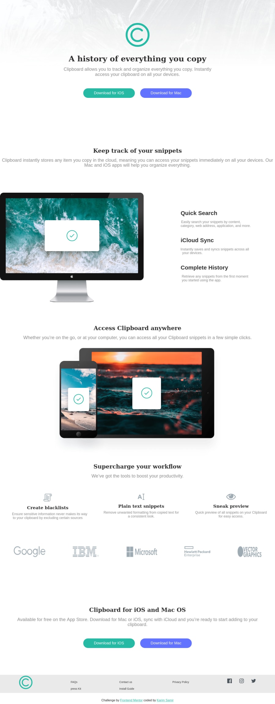
Design comparison
SolutionDesign
Solution retrospective
Any feedbacks are greatly appreciated!
Community feedback
- @adarshcodesPosted over 4 years ago
Hi @Karimsamir112, I believe you are doing great. You did good work on this challenge, let's see if you can make it better:
- Design aspect: a few things you can improve here, 1). It seems you are not using the font provided in the style-guide file. 2). add the attribution part in the footer, it is creating extra white space at the bottom.
- Code aspect: You must use an external CSS file for the Styling purpose, Internal CSS is considered not as good practice. So take care of it. Make a separate CSS file and add it to your HTML.
- Responsive aspect: You can make it more responsive by adding a couple of more breakpoints and use the Image's width in percentage because it looks distorted on smaller devices.
- Issues: There are a lot of HTML and Accessibility issues try to fix them. You've got an amazing opportunity to learn many things using this solution only try to fix the things and you'll learn a lot of things. Best of Luck👍 Happy Coding😀
2
Please log in to post a comment
Log in with GitHubJoin our Discord community
Join thousands of Frontend Mentor community members taking the challenges, sharing resources, helping each other, and chatting about all things front-end!
Join our Discord
