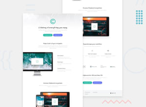
Design comparison
Solution retrospective
As it is the first 'junior' challenges, I made it as professional as it could be shown. I used a lot of nested divs and some of those divs I used them again and again. What I learned from this challenge is to design it in a paper with a pen so it would be easier and faster to write the html code. Fixed some accessibility issues.
Community feedback
- @dwhensonPosted about 3 years ago
Great job @Zer0fr0st93 🙌 - there's honestly not much I can suggest here! The site looks great and responds nicely too!! 👍
Some some suggestions:
-
I would probably wrap all your sections in a
maintag. That way you page can have the header, nav, main, and footer as landmarks. This is good for assistive tech users. -
For the icon links at the bottom, I would also add
aria-label="facebook"etc to each so that they are accessible to screen readers.
You might want to add a small transition to the hover state on them too? It feels a bit quick at the moment. Same for the links in the footer - should they have a hover?
But these are small points and don't let that detract from the top work here!!
Cheers 👋
Dave
1@billgeorgop93Posted about 3 years ago@dwhenson Thanks for your feedback. I will fix those things you mentioned.
0 -
Please log in to post a comment
Log in with GitHubJoin our Discord community
Join thousands of Frontend Mentor community members taking the challenges, sharing resources, helping each other, and chatting about all things front-end!
Join our Discord
