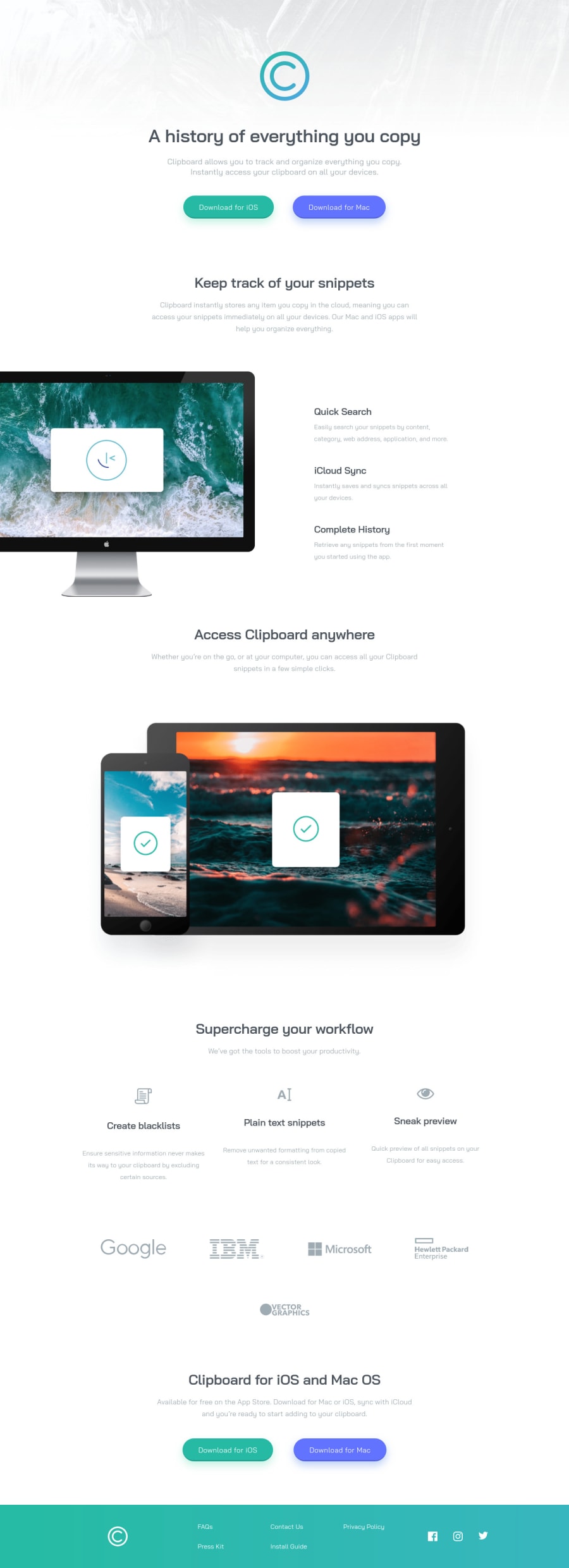
Clipboard Landing Page - Vanilla CSS (Custom Scrollbar + Easter Egg)
Design comparison
Solution retrospective
👾 Hello, Frontend Mentor coding community. This is my solution for the Clipboard Landing Page challenge.
A quick challenge with some customization.
I added some custom features:
- 👨🔬 Custom colored footer and scroll bar**
- 👻 Easter Egg
- 🎨 Intro animations
🍚Follow me in my journey to finish all HTML/CSS
only challenges (Only 5 missing)! Gotta Catch ’Em All
Ill be happy to hear any feedback and advice!
Community feedback
- @ApplePieGiraffePosted about 2 years ago
Hi, Lucas 👾! 👋
Nice to see you complete another challenge! 😀 Fantastic work on this challenge! 🙌
You've also been doing an amazing job giving feedback to the community! Keep it up! 🤩
After taking a look at your solution, here are a few things I'd like to suggest,
- Most of the content of the page should be contained within the
main
element (with the exception of theheader
andfooter
elements). All of thesection
elements that you have outside of themain
element can be moved to be inside it. - There is no need to use an
article
element within the "Keep track of your snippets" section because that is not a self-contained element identified by a heading. A simplediv
should be fine inside there. (The same goes for other sections of the site similar to this.) - The items inside the "Keep track of your snippets" can be
li
elements contained within aul
(because those are a list of features). - I would suggest perhaps using flexbox to center things more often than using auto margin. I find that working that way often to be easier and it allows you to save margin for adding specific amounts of space around things. (That is, unless you are working with large containers that have lots of elements inside them. Using auto margin to center those containers works rather nicely.)
- Setting the
alt
text for the icons in the "Supercharge your workflow" section to be an empty string so that it will be ignored by screen readers. That’s because those elements aren't necessary or important to the content of the page and as a result doesn’t need to be read by screen readers. This will make it easier for user who use those tools to navigate your page. - Adding some more descriptive
alt
text to the logos near the bottom of the page (just something simple like "Hewlett Packard logo" instead of just "hp". That’s becausealt
text is read by screen readers to describe images to users, so it’s important to writealt
text that makes sense and will give users a good sense of the content and purpose of an image. - Turning the social media icons in the footer of the page into links by wrapping each of them in a link tag.
If you have any questions, let me know! 🙂
Hope you find this helpful. 😊
Keep coding (and happy coding, too)! 😁
Marked as helpful3@ApplePieGiraffePosted about 2 years agoAlso, your CSS file is a bit long! 😅
For your next project, consider looking into using a preprocessor such as Sass. It'll add superpowers to your CSS (through features like nesting and functions) and also allow you to split your styles into multiple files which will help reduce the number of styles you have and make writing and organizing CSS a little easier (or much easier for large projects).
Marked as helpful0@ApplePieGiraffePosted about 2 years agoAnd btw, where is the Easter egg? I tried to find it but maybe I'm blind! 😆
Marked as helpful1@correlucasPosted about 2 years ago@ApplePieGiraffe the computer on hover in the hero section 😂
1@correlucasPosted about 2 years ago@ApplePieGiraffe Hey Josh 😃
The main should wrap all the content except header and footer? I was thinking main should be used in the main block of content like the hero section and etc. I’ll fix it so. Also the article issue I was thinking was correct placed. Can you point me some material where i get explanation for these tags?
About the SASS is really something I want to study, I’m going fast in this last 5 challenges to finish all html-css challenges with Vanilla CSS-Html to study other stuff as JS, Frameworks and SASS. Do you think the way I did creating classes for paddings that repeat across the page were wrong?
Thank you for the time spent writing the feedback I appreciate that.
1@ApplePieGiraffePosted about 2 years ago@correlucas
Hey, Lucas!
Sorry, for my late reply!
Here's a very good article on how to use semantic HTML. It'll explain tags like
main
,article
,section
, and more and when to use them. 😉Creating utility classes for stuff like padding isn't a bad idea, but it would be good to use
rem
instead ofpx
so that those padding values will scale with the font-size of the page (which is a good for accessibility).Best of luck with the your next challenge!
1@ApplePieGiraffePosted about 2 years ago@correlucas
Haha, I see that Easter egg (and the goal you're going for)! 😂 Keep it up! 😉
1 - Most of the content of the page should be contained within the
- @AdrianoEscarabotePosted about 2 years ago
Mds man, esse hover na tela do mac, ficou insano kkkkkkkkk nunca iria pensar nisso, não faço ideia de como você fez isso, e gostaria que você me explicasse kkkkk
A responsividade do projeto ficou ótima! Para melhorar é só arrumar os erros de acessibilidade colocando todo o conteudo em tags semânticas!
<header>content</header> <main>content</main> <footer>content</footer>
O resto está insano!
Marked as helpful1@correlucasPosted about 2 years ago@AdrianoEscarabote valeu brother, sao duas imagens do pc uma com a tela diferente, ai uma imagem ta por cima da outra e com o hover fazendo display none na imagem que ta por cima, igual eu fiz no desafio product preview perfume.
Eses erros de acessibilidade são foda, pq criei várias classes estilo framework pra parring e flex. Quando vc coda com framework da esse tipo de erro tbm? Tipo uma section só com uma classe de margem dando erro de landmark?
1@AdrianoEscarabotePosted about 2 years ago@correlucas eu entendo o que você quis dizer, no ultimo desafio eu passei por esse problema de criar uma div apenas para margin ou padding, mas, no seu código é bem de boa de resolver.
Observei que você usou a tag
main
bem no começo do código, não tem problema, mas, seria interessante pensar assim, "o começo do meu código é o conteúdo principal do meu projeto?"E logo abaixo da tag
main
vem 5 sections, para resolvermos isso de uma forma simples poderiamos, colocar uma tagheader
no lugar damain
, e colocar a tag main como o elemento pai dessas 5 section!Dessa forma teriamos uma organização e um código bem claro, para qualquer pessoa que fosse ler!
Espero que tenha ficado claro ahuauahauh
Isso é apenas uma forma de ter um código melhor organizado, e resolver os problemas de acessibilidade! mas existem outras formas também, mas acho que para o conteúdo deste projeto essa é a mais adequada!
Marked as helpful0@correlucasPosted about 2 years ago@AdrianoEscarabote Valeu lek, eu entendi errado o conceito de main, achava que era pra colocar o bloco principal dentro dele. Vou resolver os outros problemas, valeuuu
1 - @BielCoelhoPosted about 2 years ago
Afim de trocar uma ideia mano? Se tiver me chama no discord ukpkmkk#8581 Tava querendo conversar com outros novatos, anima na caminhada
0@correlucasPosted about 2 years ago@BielCoelho fala Gabriel, beleza? Entra no Slack do Frontend Mentor, eu participo lá, discord eu nem uso. Vale mto a pena o slack tem mtas dicas e resoluções no canal oficial do FEM.
https://www.frontendmentor.io/slack
0
Please log in to post a comment
Log in with GitHubJoin our Discord community
Join thousands of Frontend Mentor community members taking the challenges, sharing resources, helping each other, and chatting about all things front-end!
Join our Discord