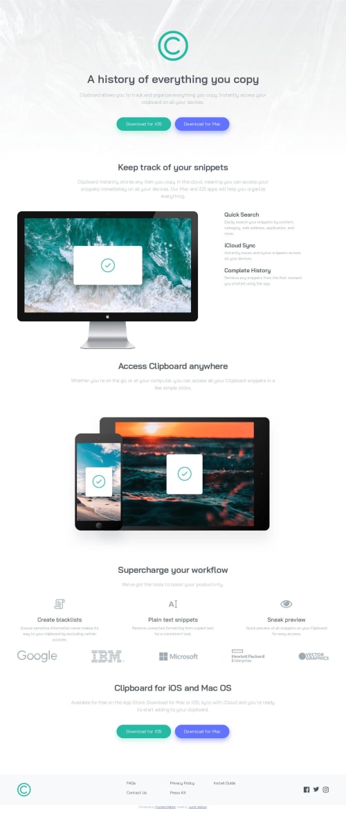
Clipboard landing page utilizing bootstrap and CSS grid

Solution retrospective
I'm proud that I used a framework I'm unfamiliar with to produce this project, that framework being bootstrap. I had to look up a lot of documentation but in the end I made it work. Next time, I would probably spend a bit more time with bootstrap before diving into a project with it.
What challenges did you encounter, and how did you overcome them?The main recurring challenge I encountered was that certain bootstrap classes implement several css properties at once, and some of those may be unwanted, like card for example. So i'd have to use my browser inspector to see what a class is actually doing, and then override that with my own vanilla css. After a while, i got used to this flow.
What specific areas of your project would you like help with?Mainly just improving the accessibility, and any semantic html that needs to be worked on. I feel like I tend to neglect these areas at times.
Please log in to post a comment
Log in with GitHubCommunity feedback
No feedback yet. Be the first to give feedback on Justin Watson's solution.
Join our Discord community
Join thousands of Frontend Mentor community members taking the challenges, sharing resources, helping each other, and chatting about all things front-end!
Join our Discord