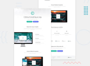
Design comparison
SolutionDesign
Solution retrospective
Hi!!
Check out my code! Any suggestions on how I can improve are very welcome.
Keep Coding!
Community feedback
- @rohailtahaPosted over 3 years ago
Great Effort! I would like to give some suggestions:
- You could increase the contrast of the paragraph texts as it is low. I know the style guide had this gray color but it has low contrast and you would always want to avoid that.
- You can add a max-width property to paragraph-texts or their parent container so each line of paragraph does not become too long. It is UI design good pratice to keep the text lines short as they are easier to read.
- There is a lot of padding in container1 and the content squeezes in too much when large screen size is reached. You can completely avoid padding and use max-width and margin:0 auto(to center) and achieve the same effect.
I hope this is helpful. Keep up the good work.
Marked as helpful0@yvsminvsPosted over 3 years ago@Rohail77 Thank you so much for your advices! They will definitely help me to improve my future work.
0
Please log in to post a comment
Log in with GitHubJoin our Discord community
Join thousands of Frontend Mentor community members taking the challenges, sharing resources, helping each other, and chatting about all things front-end!
Join our Discord
