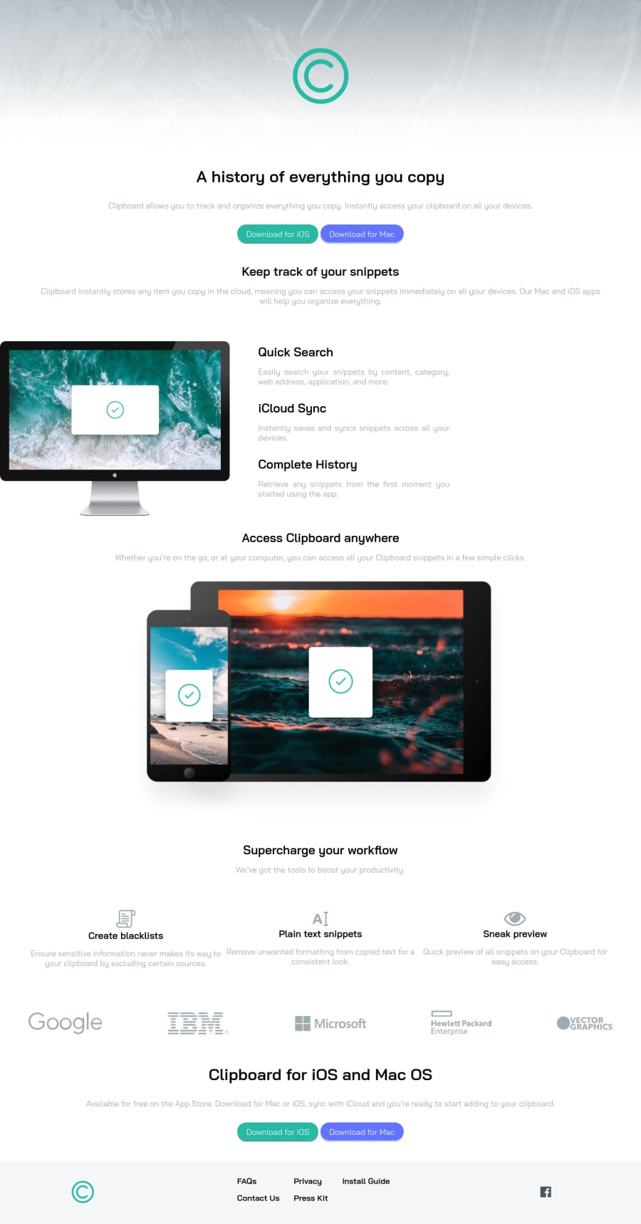
Design comparison
Solution retrospective
Any tips to improve the responsiveness would be appreciated
Community feedback
- @Just9krishPosted over 2 years ago
First congratulations for completing this challenge.
As you asked for improvement of responsiveness so my recommendations for you should use mobile first approach, where you design for mobile first then for other display size. This will improve lot and use more flexbox and grid this will reduce the media queries and make things simple.
And the problem i see in your solution is that your btn and other content stretched completely to the edge of mobile screen and that things generally people don't like it. There should be some margin. And use more spacing or padding or margin, cuz content are like they are glue to each other in my opinion.
But good with solutions keep griding.
0
Please log in to post a comment
Log in with GitHubJoin our Discord community
Join thousands of Frontend Mentor community members taking the challenges, sharing resources, helping each other, and chatting about all things front-end!
Join our Discord
