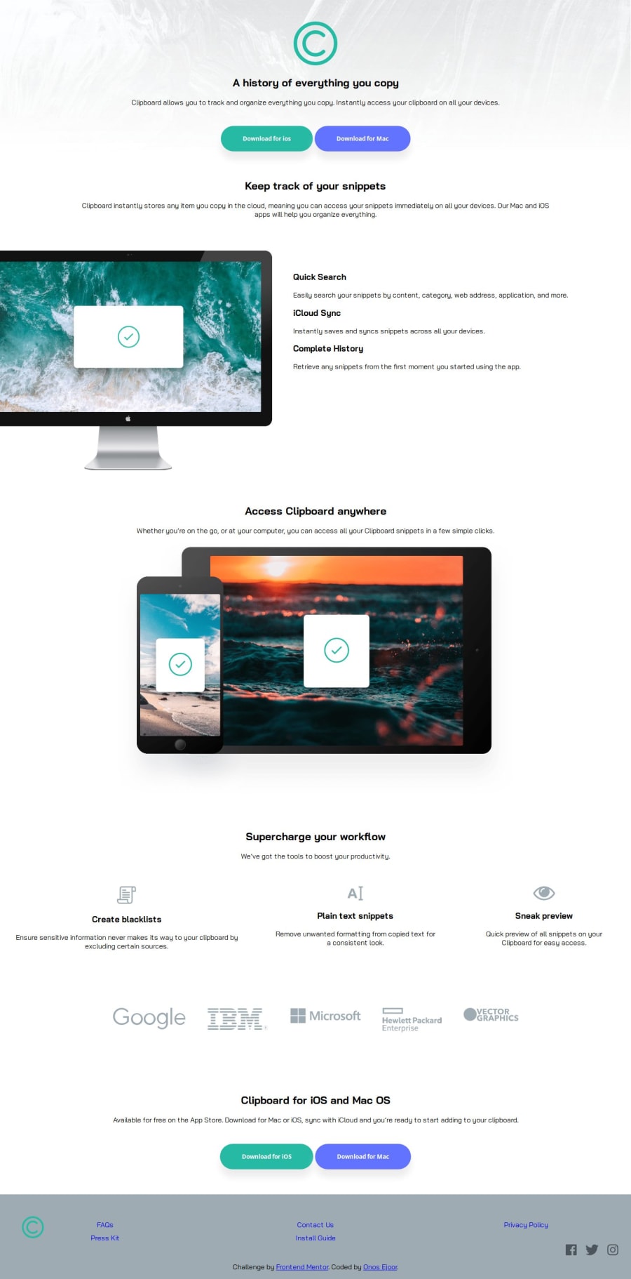
Design comparison
Community feedback
- @H4m4kPosted 9 months ago
Hi Onos Ejoor! Congrats on solving the challenge - good job!
- I have noticed that you are using <section> tag for all of your markup. It works but i would point your attention towards reading HTML 5 Semantic elements.
- consider using
background-repeat: no-repeatin your header ID - the design is supposed to be created to a max width of 1440px , so I would advise creating a class ( e.g. container or wrapper ) in your CSS and adding max width as described in the style guide - like so :
.container { max-width: 1440px } - after that i would add
margin: 0 auto;-.container { max-width: 1440px ; margin: 0 auto;} margin: 0 auto- will set automatic margin on left and right after limiting the width and in effect center your content- after we have our width set and content centered we can add this class to each
<section>in body you have or if you read the article i've posted , add class to<header>,<main>and<footer>tags. - in case You need a source of tutorials check freeCodeCamp
- last tip i would suggest using W3C Validator before submitting your solution, you will catch all the possible errors before we catch them :)
Marked as helpful1@onosejoorPosted 9 months ago@H4m4k thank you so much for the review. I'm still a learner and this review will help alot. Once again thank you. ill try it out in my next projects
0 - @amerrikaPosted 9 months ago
Hello Onos Ejoor,
Congratulations on the completing your first challenge. It's not an easy one.
I have a tip regarding your CSS code. You can use a single class to style multiple elements. Let's take a look at your buttons.
First, we create a class "button" which styles are going to be used by both buttons.
.button {
  border: none;
  padding: 10px 30px;
  transition-duration: 0.4s;
  border-radius: 30%;
  margin-top: 2%;
  font-weight: 700;
  text-align: center;
  box-shadow: 0 18px 16px hsl(0, 6%, 93%);
}
Then, you can create another class for each button to create some individual styles:
.button-1 {
  background-color: hsl(171, 66%, 44%);
  margin-right: 1%;
}
.button-1:hover {
  background-color: green;
  color: white;
}
.button-2 {
  background-color: hsl(233, 100%, 69%);
}
.button-2:hover {
  background-color: blue;
  color: white;
}
Now, button-1:hover and button-2:hover are using the same color, so you can write like this and delete this color property above:
.button-1:hover,
.button-2:hover {
color:white
}
In your HTML file you write the following:
<button class="button button-1">Download for ios</button> <button class="button button-2 ">Download for Mac</button>I really hope this helps you a bit. You can try to apply this on your other css styles.
Good luck!
Marked as helpful0@onosejoorPosted 9 months agoThank you so much @amerrika. this is a very helpful tip to me. i'm still a learner so i don't know much yet. I'll try it out
1
Please log in to post a comment
Log in with GitHubJoin our Discord community
Join thousands of Frontend Mentor community members taking the challenges, sharing resources, helping each other, and chatting about all things front-end!
Join our Discord
