Design comparison
SolutionDesign
Solution retrospective
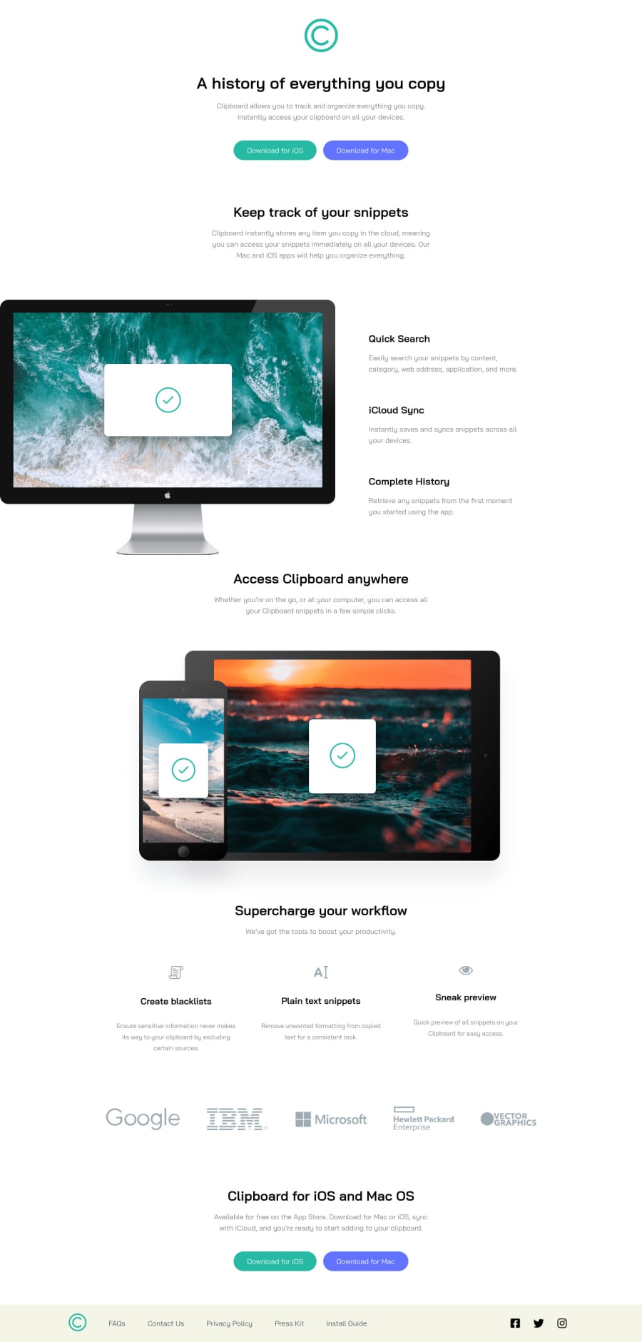
This is a tough challenge if you really want to test how you can layout things on a website, and then make it responsive in smaller widths/screens. It took me quite a bit of time, and yeah I am pretty satisfied with the result - obviously can't match the design 100% though.
Community feedback
- @hmadamkPosted about 2 years ago
- Awesome work passing accessibility ✅ currently I'm learning adavnced accessibility when I'm done I will cover SEO I hope to be more helpful then but here's some design tips
- I know it's kind of struggle to make your design look like the snapshot, here's what id do, start your design from mobile or desktop whatever you prefere I prefere mobile but let's go with desktop open the browser inspector make the size 1440px(the width of the design on desktop) and try to make the deign looks the same as the image then do the same to 375px(the width of the design on mobile) and just make sure every thing doesn't break in the middle by using flexable value for more information try kevin powell course on conquering responsive layouts it's really good
- I know your site is good but here's some advice for future, make sure that your website looks good after zooming in to 200% so if someone can't see well he can zoom and still use your website
- for the button if you want them to look like the design do the following
a{ box-shadow: 0px 4px 0 0px {your color goes here}; } a:active{ box-shadow: none; or box-shadow: 0px 2px 0px 0px {your color goes here}; }- your doing very great though keep up the goog work
Marked as helpful0@NationsAnarchyPosted about 2 years ago@hmadamk I was a bit lazy + tired today - so I didn't do the box-shadow for the buttons. Thanks anyway!
0
Please log in to post a comment
Log in with GitHubJoin our Discord community
Join thousands of Frontend Mentor community members taking the challenges, sharing resources, helping each other, and chatting about all things front-end!
Join our Discord
