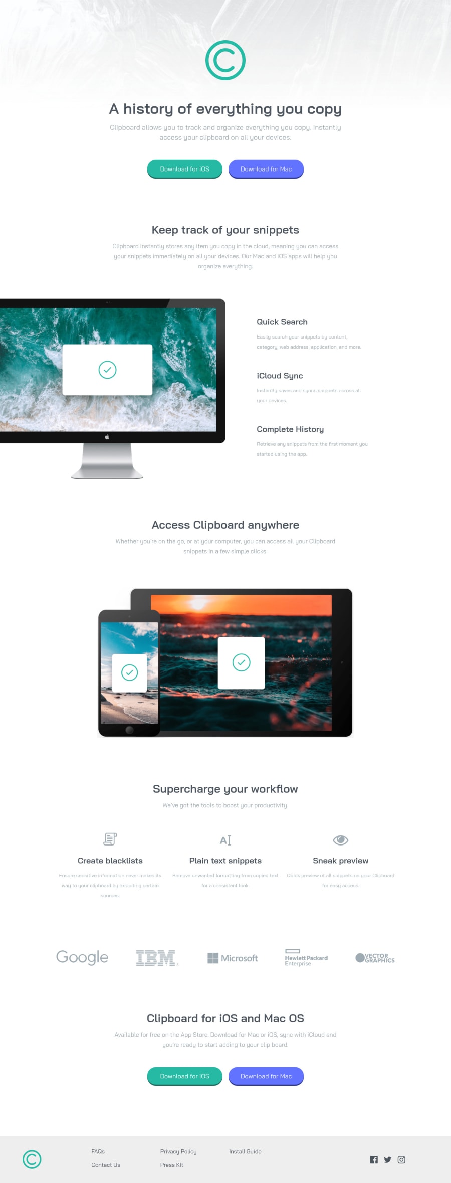
Design comparison
Solution retrospective
Hi, looking forward to hearing from everyone.
In this challenge, I only had a little trouble when responsive (I built Desktop-First, then to Mobile version), and suddenly realized that it would be easier to build this project in the Mobile-First direction.
So I want to ask when should I build in Desktop-First direction, when should build in Mobile-First, or should both at the same time (after completing a component, responsive it before going to next component) ? 🤔🤔
Community feedback
- @sandro21-glitchPosted almost 2 years ago
Hi Nghia👋
The choice between desktop-first and mobile-first design depends on the specific requirements of your project and audience. Here are some general guidelines:
Mobile-First Design:
You prioritize the mobile experience, and design for smaller screens first, then add styles and adjust for larger screens. Use when your audience primarily accesses the website on mobile devices.
Desktop-First Design:*
You prioritize the desktop experience, and design for larger screens first, then adjust for smaller screens.
Use when your audience primarily accesses the website on desktop computers.
Both:
You design and develop the components of your website and make them responsive before moving to the next component. Use when your audience accesses the website on both mobile and desktop devices, and you want to ensure an optimal experience on all screen sizes.
Ultimately, the choice between these approaches should be informed by data on your audience's device usage and their needs and expectations for the website experience.
Good Luck
Marked as helpful0
Please log in to post a comment
Log in with GitHubJoin our Discord community
Join thousands of Frontend Mentor community members taking the challenges, sharing resources, helping each other, and chatting about all things front-end!
Join our Discord
