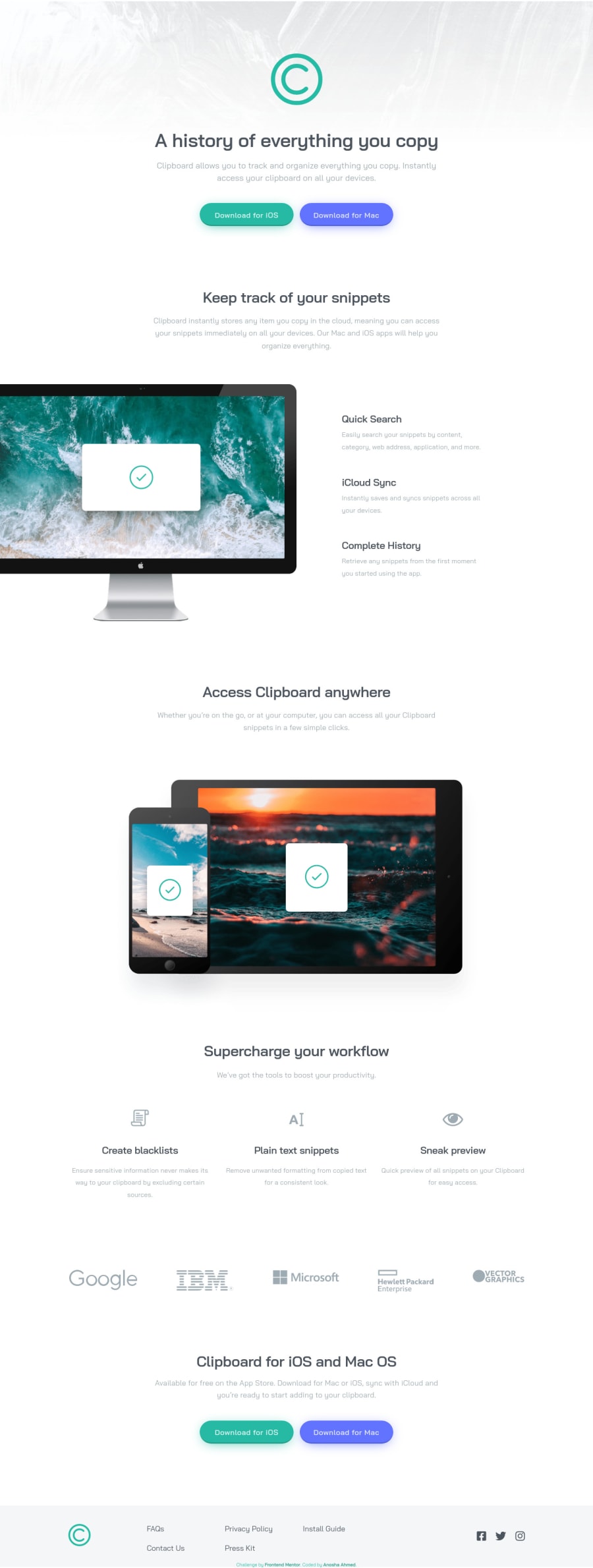
"clipboard landing page" + sass + flexbox + mobile-first + responsive
Design comparison
Solution retrospective
First time using SCSS! I love it! It's so convenient!
One thing I wish I had done differently is not nesting. I don't know why I was nesting at first... maybe because I was using SCSS for the first time?and it felt cool? But when it came to do media queries, it was so inconvenient to deal with specification etc. I'm gonna make sure not to do that again if I don't need to.
One problem I kept having, with this solution, was that every time I would save, and my live server would reload, the font-size of random paragraphs would appear larger than before I saved last time. And it was weird because I didn't even touch the font-size of those paragraphs. So, I would stop the live-server and open it again, and the font-size would be back to normal. Then I'd save again, and the font-size would appear larger. Ugh, it was such a hassle.
But yay I'm happy with the result!
Community feedback
- @vanzasetiaPosted almost 3 years ago
๐ Hi Anosha Ahmed!
๐ Congratulations on finishing this challenge! ๐ Your solution is responsive and pixel-perfect based on the design comparison! ๐Good job!
I have some feedback in this solution:
- Create a custom
:focus-visible
styling to any interactive elements (button
, links,input
,textarea
). This will make the users can navigate this website using keyboard (Tab
) easily. - In this case, there's no
header
, so you can put everything inside themain
element. Also, theheader
should not contain hero section, which in this case thesection
with the classheader__section
. Also, all the elements should be inside thesection
tag, since it is the part of that section.
<section class="header__section"> <div class="header__logo"> <img src="images/logo.svg" alt="#"> </div> <h1 class="heading--1">A history of everything you copy</h1> <p class="desc"> Clipboard allows you to track and organize everything you copy. Instantly access your clipboard on all your devices. </p> <div class="header__btns btns"> <a href="#" class="btn--cyan">Download for iOS</a> <a href="#" class="btn--blue">Download for Mac</a> </div </section>
- I would recommend every section is wrapped by
section
tag for better semantic markup. Eachsection
should contain a heading tag (h2
).
<section> <h2 class="heading--2">Keep track of your snippets</h2> <p class="desc desc--snippets"> Clipboard instantly stores any item you copy in the cloud, meaning you can access your snippets immediately on all your devices. Our Mac and iOS apps will help you organize everything. </p> ... some code <div> <h3 class="heading--3">Complete History</h3> <p class="desc">Retrieve any snippets from the first moment you started using the app.</p> </div> </div> </div> </section>
- You can make it(the below code & another part of your code) as an unordered list and wrap each item with
li
. Also, there's no reason to make the textQuick Search
,iCloud Sync
, andComplete History
as a heading. The below content is too small. You can think of the heading tag as a title on a document file.
<div class="snippets-container__text"> <div> <h3 class="heading--3">Quick Search</h3> <p class="desc">Easily search your snippets by content, category, web address, application, and more.</p> </div> <div> <h3 class="heading--3">iCloud Sync</h3> <p class="desc">Instantly saves and syncs snippets across all your devices.</p> </div> <div> <h3 class="heading--3">Complete History</h3> <p class="desc">Retrieve any snippets from the first moment you started using the app.</p> </div> </div>
- The logo image is an important image since it identifies the users what website they are currently at. so you can use the company name which is Clipboard as the alternative text.
- The alternative text for any image should not contain the word, image, logo, etc, since the screen reader will pronounce it as an image and the user will know that it is a logo (the same as we see the image).
- Don't change the
html
(root) font size. It can serious issue. Read what an accessibility expert has said about it. Since you are using Sass, you can create arem()
function that can automatically convert thepx
torem
for you.
@function rem($value) { @return ($value / 16) * 1rem }
- How it works:
/* In Sass file (.scss) */ body { font-size: rem(16); } /* In CSS file */ body { font-size: 1rem; }
That's it! Hopefully, this is helpful!
Marked as helpful2@anoshaahmedPosted almost 3 years ago@vanzasetia Wow, thank you for teaching me new things, Vanza!!!!!!!!! Some of your points are going straight into my notes. I appreciate you so much!
0@vanzasetiaPosted almost 3 years ago@anoshaahmed You're welcome! Glad to know that it is helpful!
1@vanzasetiaPosted almost 3 years ago@anoshaahmed I have one suggestion that I forget to mention earlier, you don't need to push the
node_modules
folder to the GitHub repo.I would recommend creating and pushing the
.gitignore
file so that if you or somebody else want to work with it, they don't need to worry about unwanted file like (.DS_Store
) or folder getting pushed to the GitHub repo.Marked as helpful1@anoshaahmedPosted almost 3 years ago@vanzasetia I ACTUALLY NEEDED TO KNOW THAT LOL. i googled it but i still didn't know for sure so thank u for letting me know.
One question though: Would my Git Page keep working?
2@vanzasetiaPosted almost 3 years ago@anoshaahmed Yes, the GitHub page is fine without the
node_modules
folder.Marked as helpful1 - Create a custom
- Account deleted
I really appreciate your interest in every detail while you designing and coding, You gonna be a great one in the near future โบโบ.
Marked as helpful2 - @rohitkuderiyaPosted almost 3 years ago
Hey mam, I am a big fan of your coding skills and give you a lot of love from India ๐ฎ๐ณ . Actually I am a fresher and Firstly , I just see your code and try to do it but I have a question. From where do you get the svg files , images and other things for the code. I will be really very happy if you tell me the way of getting them or if , it's a secret then no problem. Thank you @anoshaahmed
Marked as helpful1@anoshaahmedPosted almost 3 years ago@rohitkuderiya when you start a challenge, you should have the option to "download starter." frontend mentor provides the images. here's the link to the challenges. good luck :)
0 - @xZAYEDxPosted almost 3 years ago
Really nice neat work! I hope to be as good as you someday :')
Marked as helpful1@anoshaahmedPosted almost 3 years ago@xZAYEDx you're better than me. i just spend a lot of time trying to get the right measurements
0 - @MaysMajeedPosted almost 3 years ago
Good Job on that @Anosha
Marked as helpful1 - @dzoni19Posted almost 3 years ago
Good job! Excellent response for any device!
Marked as helpful1 - @webstormcamPosted almost 3 years ago
This comment was deleted almost 3 years ago
1 - @elroytoscanoPosted almost 3 years ago
Hi Anosha, you've done a great job at the design. Pixel Perfect. The animations are really smooth ๐
There's just one issue, the
buttons
are designed witha
(link) as the element, which is semantically incorrect as when you click on any of thebuttons
, notice theurl
changes tohttps://anoshaahmed.github.io/fem12-clipboard-landing-page/#
. The "#" symbol at the end represents thehref
of thelink
element which directs you to another page instead of abutton
. Here's an article to help you out with the differentiation between these elements: Difference between link and button.Hope this helps.
Marked as helpful1@anoshaahmedPosted almost 3 years ago@elroytoscano Yeah I know, I did that on purpose. Clicking those links takes you to
/#
because there's nowhere to go, as this is a demo landing page.However, if this was a real landing page, it would take the user to another page, that's why I chose to use
<a>
.Although, I always appreciate your input, Elroy, thank you.
1 - @rk-codeflowPosted almost 3 years ago
Look so clean. But if you are not going to use nesting then won't it feel like using vanilla CSS again?? Nesting makes us write less code which I love.
Marked as helpful1 - @darryncodesPosted almost 3 years ago
Hey Anosha,
You've smashed this - really well done!
Welcome to SCSS. Regarding your point about nesting and media queries - this might be worth trying: see my example on line 10 and 97
Hope it helps!
Marked as helpful1@anoshaahmedPosted almost 3 years ago@darryncodes Damn this is some advanced sh*t lol. It does help!! Thanks Darryn :D
0 - @akashsiddamshettyPosted almost 3 years ago
Great work โจ @anoshaahmed
Marked as helpful1 - @PhoenixDev22Posted almost 3 years ago
Your solution is absolutely perfect. I canโt wait to try to solve it , Keep up Anosha Ahmed!
Marked as helpful1@anoshaahmedPosted almost 3 years ago@PhoenixDev22 Thank you !!! Good luck ๐
0 - @FeelshotPosted almost 3 years ago
Nice work! ๐
Marked as helpful1 - Account deleted
How do you always fit the solution and the design comparisson?
Nice!
Marked as helpful1@anoshaahmedPosted almost 3 years ago@Daviddp96 By spending a lot of time getting headaches LOL
0Account deleted@anoshaahmed Yeah but what are you comparing against? The design has a certain far away perspective
0Account deleted@anoshaahmed ._.
Marked as helpful1 - @therealmaduanusiPosted almost 3 years ago
Honestly I have to give it to you, your pixels are just so good ๐ I couldn't even get the exact background color when am building๐. Best of luck on your journey ๐๐
Marked as helpful1@anoshaahmedPosted almost 3 years ago@therealmaduanusi thank u so much :) this solution took a while to be pixel perfect
0 - @codewithneerajPosted almost 3 years ago
No doubt @anoshaahmed you have done really great job.
Marked as helpful1 - @skyv26Posted almost 3 years ago
Really Nice Work !
Marked as helpful1
Please log in to post a comment
Log in with GitHubJoin our Discord community
Join thousands of Frontend Mentor community members taking the challenges, sharing resources, helping each other, and chatting about all things front-end!
Join our Discord