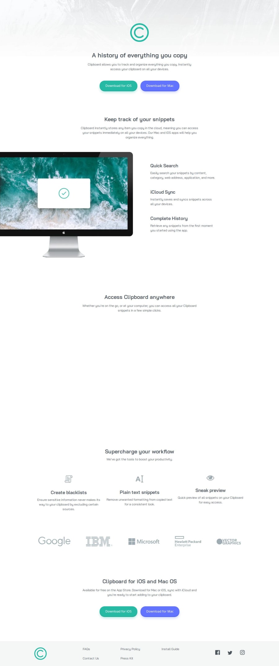
Design comparison
Solution retrospective
I was able to get a performance score of 100 on the Google speed test which was my aim. Now I will still try to get 100 across the board on everything else. I only got accessibility left but I can't do much about that unless I deviate from the design of the challenge.
What challenges did you encounter, and how did you overcome them?For the first time, I did a mobile-first styling and I found it a little difficult to make it look similar to the design for desktop as it seems like the designs aren't consistent because the spaces are all different for mobile and desktop on the images, at least it looked different anyway. It may have just been a fault from me. It felt like the typography was off as well, I tried my best to match it but not all of it matched, unfortunately.
What specific areas of your project would you like help with?I struggled a little with making the top image responsive as the text overflows above the image. Thinking about it now, I'm thinking I should have just used position: absolute; but it feels like that wouldn't be responsive.
I would like tips on how to make the website closer to the design.
Community feedback
- @Illyaas4ShowPosted 5 months ago
Also, I just remembered, that the image of the Mac on the desktop version of the design is different from the image on the mobile design but only the desktop version of the image was added to the images folder.
0
Please log in to post a comment
Log in with GitHubJoin our Discord community
Join thousands of Frontend Mentor community members taking the challenges, sharing resources, helping each other, and chatting about all things front-end!
Join our Discord
