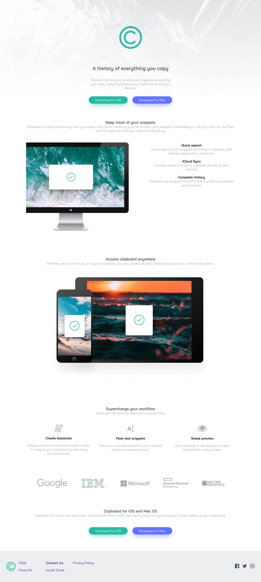
Design comparison
SolutionDesign
Community feedback
- @grace-snowPosted almost 3 years ago
Hi
A few accessibility issues on this
- the sr only h1 shouldn’t be there, that’s the name of the site not the page h1
- similarly the logo should not be hidden. It’s the most important content and should say the product name
- after that, all heading levels go up
- the headers in the sections are unnecessary. They add no benefit and are more likely to create noise and annoyance for screenreader users who like to navigate via landmarks
- company logo images shouldn’t be hidden, they’re valuable content. I know you’ve added the sr only text in but that doesn’t help text to speech users who will hover those images and want them to announce. Much better to just have the company names in the image alt text
- social links are external so don’t need to go in a nav really. Again, not ‘wrong’ but unnecessary
Sometimes in trying to “add accessibility in” we can add frustration into solutions and over engineer. Focus on the most important things like heading and content structure, interactive elements, focus-visible style, image alts etc. Focus less on sections and extra landmarks
Marked as helpful0
Please log in to post a comment
Log in with GitHubJoin our Discord community
Join thousands of Frontend Mentor community members taking the challenges, sharing resources, helping each other, and chatting about all things front-end!
Join our Discord
