

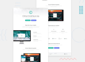
Design comparison

Solution retrospective
Hello here I hope you are well. This is my new challenge and I am open for suggestions , critics for upgrading. I just tried to make the responsive step. I am waiting for critics
Community feedback
- @RazaAbbas62Posted 10 months ago
Hi there, it looks well, but you should not use such a bold font weight for sub-headings, and the paragraph for the second section should have a max-width set and should be centered.
it's okay. it's just a suggestion.
happy coding :)
Marked as helpful0@Jojo-onedevPosted 10 months agoOk thanks for your suggestions, but is the responsive well? @FazeenIjaz
0@RazaAbbas62Posted 10 months ago@Jojo-onedev it is good but you are setting width and height for each section, which is hindering the way to be responsive,
for image u should use max-width:100%, instead of setting width for each breakpoint , max-width:100%, will automatically make it responsive,
for each section don't use any specific width or height , let it be auto set . for buttons add flex-direction :column, for smaller screens. and make font-sizes a little smaller on small screens .
I hope it will help you in future projects. :)
Marked as helpful0

Please log in to post a comment
Log in with GitHub
Join our Discord community
Join thousands of Frontend Mentor community members taking the challenges, sharing resources, helping each other, and chatting about all things front-end!
Join our Discord