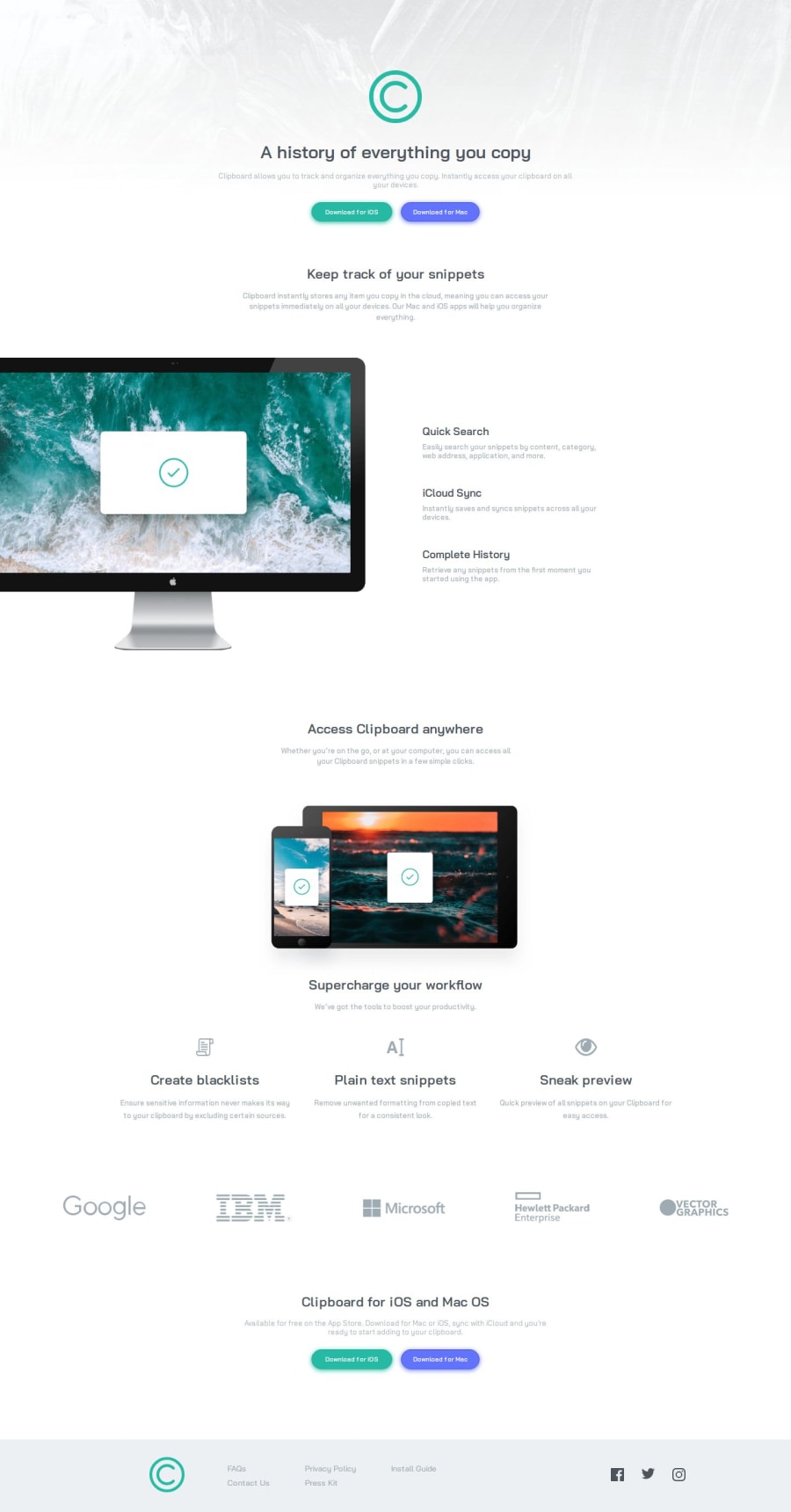
Clipboard Landing Page – Responsive with CSS Grid & Flexbox

Design comparison

Solution retrospective
I’m proud that I got the overall layout working with CSS Grid and Flexbox, and I managed to make it responsive across different screen sizes. It wasn’t easy, especially with positioning some elements like the background image and making sure the sections aligned correctly. Also, figuring out how to handle the button shadows and icon spacing was a good learning experience.
That said, the responsiveness still isn’t perfect, and that’s something I’d like to improve. Some sections don’t scale as smoothly as I want, especially in the tablet range, and I feel like the footer could be better structured. Next time, I’d focus on testing responsiveness earlier in the process rather than fixing it later. I’d also like to refine my approach to handling images inside grids and flex containers to make sure they adjust properly without extra tweaks.
What challenges did you encounter, and how did you overcome them?One of the biggest challenges was getting the background images and sections positioned correctly, especially the header background and the computer image in the snippets section. At first, the images weren’t spanning the full width or were getting cut off weirdly. I had to adjust things like object-fit, overflow, and transform properties to finally get them placed correctly.
Another struggle was making the layout fully responsive. It worked fine on desktop and mobile, but the tablet version was tricky—some elements didn’t scale properly, and the footer layout kept breaking at mid-screen sizes. To fix that, I tweaked the grid structure and adjusted margins, but it’s still not perfect. I also had issues with spacing between elements, especially aligning the icons in the workflow section, which took some trial and error with grid and flexbox.
Overall, I overcame these issues by experimenting with different CSS properties, using DevTools a lot, and testing across various screen sizes. It took some back and forth, but I learned a lot about handling responsiveness more efficiently.
What specific areas of your project would you like help with?The responsiveness still isn't perfect, especially between 375px and larger tablet sizes. Some elements don’t scale smoothly, and the footer layout looks off at certain breakpoints. I’d love some feedback on how to make the layout adapt more consistently across all screen sizes.
Also, I feel like the background images and section alignments could be improved. I had to tweak things like overflow, transform, and positioning, but I’m not sure if I did it in the cleanest way. If anyone has a better approach for handling responsive images, that would be super helpful.
Lastly, the spacing in some sections (especially the icons and text alignment in the workflow section) could probably be refined. If there’s a better way to structure the layout with CSS Grid or Flexbox, I’d love to hear suggestions!
Community feedback
Please log in to post a comment
Log in with GitHub
Join our Discord community
Join thousands of Frontend Mentor community members taking the challenges, sharing resources, helping each other, and chatting about all things front-end!
Join our Discord