Design comparison
Solution retrospective
Hello coders,
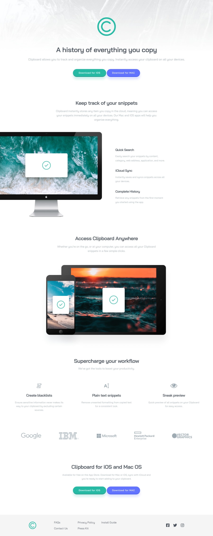
This is my first big project...and i can tell you it gave me a headache...hahaha I still stuggling with @media and then especially with the sizing of the background-image and the first lager image of the display . When i resize it from 1440px to 375px it does not scale perfectly. Can anyone tell me how to scale it perfectly so that it looks nice?
Also have a question on naming elements with classes like for example <ul class="list-menu">
I see some youtubers giving almost every element a class name like this:
<nav class="menu">
<ul class="menu-list">
<li class="menu-list-link"><a href="#" >FAQs</a></li>
<li class="menu-list-link"><a href="#">Contact Us</a></li>
<li class="menu-list-link"><a href="#">Privacy Policy</a></li>
<li class="menu-list-link"><a href="#">Press Kit</a></li>
<li class="menu-list-link"><a href="#">Install Guide</a></li>
</ul>
</nav>
<nav class="nav>
<ul>
<li><a href="#">FAQs</a></li>
<li><a href="#">Contact Us</a></li>
<li><a href="#">Privacy Policy</a></li>
<li><a href="#">Press Kit</a></li>
<li><a href="#">Install Guide</a></li>
</ul>
</nav>
Is it not better for readability to do when you styling your html: .nav ul li
then making for every li
a class name .menu-list-link
?
Hope to get some feedback!
Thanks!
Community feedback
- @shivaprakash-sudoPosted over 2 years ago
Hello dvbenthem,
- Regarding the background image, you can do
background: center / cover no-repeat url(image-link)
to centre the image and cover the screen fully. - I didn't quite understand about the image scaling, can you please elaborate?
- For
keep-track
andsupercharge
sections, you can use flexbox inside them instead of grid since there aren't enough elements to form a grid like structure. - In your CSS, you don't need to write the entire CSS again in @media queries, just write for mobile devices first and then change only things needed for bigger screens, like sizing and layouts.
Other than those things, your website and code look good. Good luck for the future projects.π
Marked as helpful1@dvbenthemPosted over 2 years agoHello @shivaprakash-sudo,
Well the first image of the display shifts al the way to the left when i resize the window beyond 1440px. But as what @Enmanuel Otero Montano said i have to use more than one @media query to style the image properly?
I do find it difficult sometimes which one I have to use grid or flex box. Is there some sort of a rule when u can use grid or flexbox?
Thanks again for your feedback! :)
0@shivaprakash-sudoPosted over 2 years agoHello @dvbenthem ,
You don't have to put a media query for screens beyond 1440px width, because most people don't have such larger screens and you can put a maximum width for the content. You can position the image as absolute after a certain width e.g., 900px or 1000px., relative to its parent, so that it doesn't move anywhere else.
Try to have media queries with smaller screens first, like 600px and end with larger screens like 1024px, but don't put too many of them. I would suggest to put 1024px as the maximum width for the page content in most cases.
Also, whenever you put media queries, you don't need to write the entire CSS, just change what needs to be changed at that width.
Flex is good when you have mostly column based content, which is what we have mostly in this project. Grid is most useful when you have 2 dimensional flow of elements (both rows and columns), like a picture gallery.
Good luck.
Marked as helpful1 - Regarding the background image, you can do
- @Enmanuel-Otero-MontanoPosted over 2 years ago
Hello dvbenthem!
The first option is better, not only for the readability of the code, but for the performance of the site as well. When you apply the first option to give styles, you directly put the class of the element to apply styles and that's it. Otherwise you would have to chain selectors until you get to the one you want to style. The thing to keep in mind when doing the latter way is that you're telling the browser to look for the element with the .nav class, then look for the ul, and then locate the li and style it. In the first way the browser goes directly to the element (it only has to locate the element with the class). The other advantage of applying styles only with classes is that you will always have the same specificity in your CSS so you will only have to worry about working with the cascade.
About class names. there are some names established by convention, for example for buttons (btn), for navigation (nav), but really you can name them whatever you want. One piece of advice I can give you about this is to always try to make your code speak for itself, that is, when another person reads it, they can perfectly understand what each thing is for.
About media queries and backgruond. I advise you to make several media queries 2 or 3 or 4, as necessary and to develop first for mobile, which is usually called "mobile first", keep in mind that today more websites are viewed on mobile phones than on computers and it will be much easier for you to adjust the styles for larger screens. The background property also has other properties to work with the size and position. I leave you a link about it.
Any doubt you can consult.
Cheers!π¦Ύπ¦Ύπ¦Ύ
Marked as helpful1@dvbenthemPosted over 2 years agoHello @Enmanuel-Otero-Montano,
I had indeed not thought of specificity when you use classes with the first option. So chaining class names is also not a good idea for the same reason, specificity? like
.menu .menu-list .menu-list-link{ background-color: #fff; }
Thanks for link about background i will look in to it.
Thanks again for your feedback.
0@Enmanuel-Otero-MontanoPosted over 2 years ago@dvbenthem Hello!
Exactly. Remember that CSS is based on 3 resources fundamentally to apply styles, Cascading, specificity and inheritance. At some point you may have to chain a couple of selectors and there will be no problems with those, also if you always or almost always apply styles with the class selector, you will very rarely have to chain selectors.
Marked as helpful1
Please log in to post a comment
Log in with GitHubJoin our Discord community
Join thousands of Frontend Mentor community members taking the challenges, sharing resources, helping each other, and chatting about all things front-end!
Join our Discord