
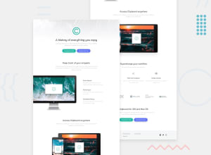
Clipboard Landing Page made with Flexbox

Design comparison

Solution retrospective
Working on this project was fun and a little challenging. Overall, I tried my best to make it look as close to the original design as I possibly could given the fact that I didn't have the Figma or Sketch original designs. If you have any feedback in mind, please feel free to share it with me. Thank you.
Please log in to post a comment
Log in with GitHubCommunity feedback
- @0xabdulkhaliq
Hello there 👋. Congratulations on successfully completing the challenge! 🎉
- I have other recommendations regarding your code that I believe will be of great interest to you.
BODY MEASUREMENTS 📐:
- The
width: 100%property forbodyis not necessary. because it's a block level element which will take the full width of the page by default.
- So feel free to remove
width: 100%style rule frombodythis will help you to write efficient code and makes your code more reusable.
.
I hope you find this helpful 😄 Above all, the solution you submitted is great !
Happy coding!
Marked as helpful - @vanzasetia
Hi, Jean Fischer Dirimasi! 👋
Here are some suggestions for improvements.
- Do not wrap each
<img>with<figure>. Only use<figure>if you also use<figcaption>. - Use
<a>withdownloadattribute for the download buttons. - Not every image needs alternative text. Decorative images should not have alternative text (
alt=""). This will tell the screen reader to skip over the image. As a result, it saves screen reader users time navigating the page. - For your information, decorative images are images that do not add any information and serve only aesthetic purposes.
- The list inside the
<footer>should be a list of links, not just text. The same goes for the social media icons, they should be links. - Remove
width: 100%andheight: autofrom the<body>styling. Those are already the default styling. - Specify the
font-sizeon the<body>styling. Do not specify it on the<html>element. - Use
remoreminstead ofpxfor font sizes. Never usepxunit. Relative units such asremandemcan adapt when the users change the browser's font size setting. Learn more — Why you should never use px to set font-size in CSS - Don't use
idselectors for styling. There are two reasons for not using ID’s to style content: - They mess up specificity because they are too high (the most important reason).
- They are unique identifiers. So, they are not reusable on the same page.
- Learn more — What the ID attribute is REALLY for
I recommend writing the CSS using the mobile-first approach (using
min-widthmedia queries). The mobile layout is simple. So, you only need to add more complex styling for larger screen sizes.If you use the desktop-first approach, then you need to write more CSS to simplify the layout (usually into a one-column layout).
The mobile-first approach often results in smaller CSS. As a result, the website loads faster.
Learn more — Responsive design ground rules | Polypane
I hope this helps. Happy coding! 😄
- Do not wrap each


Join our Discord community
Join thousands of Frontend Mentor community members taking the challenges, sharing resources, helping each other, and chatting about all things front-end!
Join our Discord