Design comparison
Solution retrospective
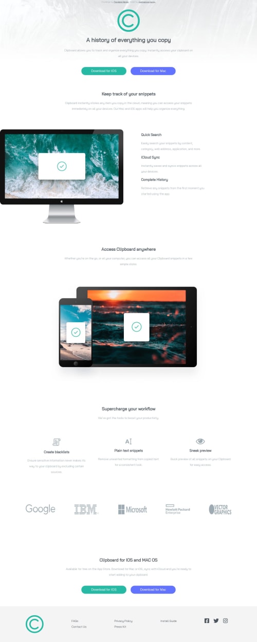
I would like to hear your feedback on how can I make the social media part of my footer stand in the center of the page for mobile width.
Community feedback
- @adarshcodesPosted about 4 years ago
Hi @nganbarova, your solution looks nice. For making the social media part to center remove the
float: left
from the social id and addmargin-left: 30px
(30px seems fine to me, you can tweak to see what is best). A couple of things you can also modify are:- the attribution part should be in the footer section instead of on the top.
- the Tech giants logo seems a little bit stretched you can change the width of the logos differently on each. and also you can try to fix the Accessibility and HTML issues. Apart from these small things, your solution looks great and the responsiveness is also working fine. Good work. Happy coding.
1 - @SankThomasPosted about 4 years ago
Hello @nganbarova. From what I can tell, the reason it's not centered is because of some margin or padding that you added somewhere. So you can try to reset that and do it manually, or use flexbox as follows:
display: flex; align-items: center; justify-content: center;
Note that aligning items like that [only] works on block elements
0
Please log in to post a comment
Log in with GitHubJoin our Discord community
Join thousands of Frontend Mentor community members taking the challenges, sharing resources, helping each other, and chatting about all things front-end!
Join our Discord