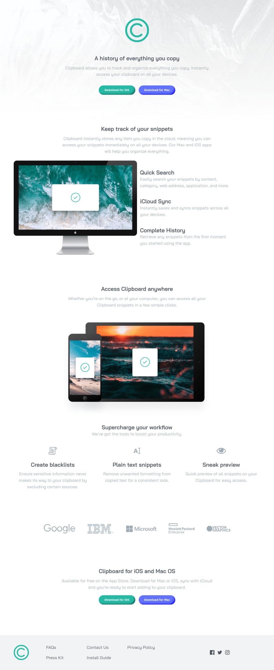
Design comparison
SolutionDesign
Solution retrospective
Any feedback about HTML or SCSS structure would be greatly appreciated.
Community feedback
- @pikapikamartPosted over 3 years ago
Hey, awesome work on this one. Desktop layout looks great, it is responsive and the mobile state looks great as well.
Some suggestions would be:
- Website-logo should be using
alt="clipboard"so that it will be clearer, lose the word "logo" in it and avoid adding those words in thealtsinceimgis already an image. - Adjust as well the
:focus-visiblestate for thebuttontags since the defaultoutlinestyling is not enough and it is hard to see where I am navigating at right now on the site. - Also, there are lots of usage of extra html element on the markup. Avoid nesting too much element so that it will be easy to handle and lookup the markup.
- Images like for the
computercould use a more descriptivealt, maybe likealt="clipboard app on a computer". Again, remove all words that relates to "graphic". - The 3 icons below before the company logos should be hidden. Decorative image must be hidden at all times by using
alt=""and extraaria-hidden="true"attribute on theimgtag. - You could use
ulon the company logos since those are "list" of companies.
FOOTER
- Website-logo should be inside a
imgtag. Interactive components uses interactive elements. By usingdivyou are making it not-accessible, especially that you are usingcursor: pointerto it, meaning it should be interactive hence theimgshould be inside aatag. - The 5 links could be inside a
navelement since those are still your website's navigation links. - Also you can use
ulon the links since those are "list" of links. - Social media links could be inside
ulsince those are "list" of links. - Each
atag that wraps social media, it should have eitheraria-labelattribute or screen-reader element inside it. The value for whatever method you will use should be the name of the social media likearia-label="facebook"on the facebook linkatag. This way, users will know where this link would take them. - Each
svginside the social media link should be hidden since they are only decoration so usearia-hidden="true"attribute on them.
Aside from those, great job again on this one.
Marked as helpful0@kzaleskaaPosted over 3 years ago@pikamart thank you for your every suggestion - it is very helpful. I will apply it in my project. 🤗
2 - Website-logo should be using
Please log in to post a comment
Log in with GitHubJoin our Discord community
Join thousands of Frontend Mentor community members taking the challenges, sharing resources, helping each other, and chatting about all things front-end!
Join our Discord
