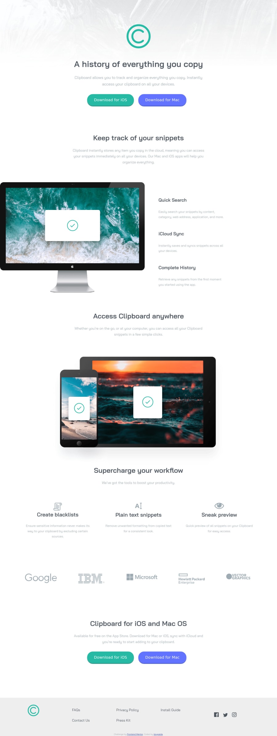
Clipboard landing page challenge using CSS grid and flexbox

Design comparison

Community feedback
- @thekarthikrPosted almost 2 years ago
Hey there, Hope you're doing well. Having a responsive website essential, Most of them access websites through their mobile, and I can see you using media queries on your website but it gets overflowing when I resize browser window.
https://developer.mozilla.org/en-US/docs/Web/CSS/Media_Queries/Using_media_queries
https://www.w3schools.com/css/css_rwd_mediaqueries.asp
I hope it helps. Happy coding.
Marked as helpful1@boypaida12Posted almost 2 years ago@thekarthikr thanks for drawing my attention to this. I set the max-width to 375px for medium screen mobile phones and below. I just checked on a Samsung s8 which has a width of 360px, meaning it fits within the max-width specification. What do you think is causing the overflow
0@thekarthikrPosted almost 2 years ago@boypaida12 You can write media queries for Tablet / Medium size devices.
1@boypaida12Posted almost 2 years ago@thekarthikr updated my code to suit tablets and medium screen phones. Thank you so much for your help bro. However, I can't seem to fix the accessibility issue on html lang ='en'. Any help?
0@thekarthikrPosted almost 2 years ago@boypaida12 In that case, the accessibility issue happens because of not considering about heading hierarchy. h1,h2,h3, it's not for different sizes, it's about how important it is. Use the h1 tag for the main content of a web page with a heading (h1).
Change it from <h2> to <h1>
<h1>A history of everything you copy </h1>Have a great time.
Marked as helpful1

Please log in to post a comment
Log in with GitHub
Join our Discord community
Join thousands of Frontend Mentor community members taking the challenges, sharing resources, helping each other, and chatting about all things front-end!
Join our Discord