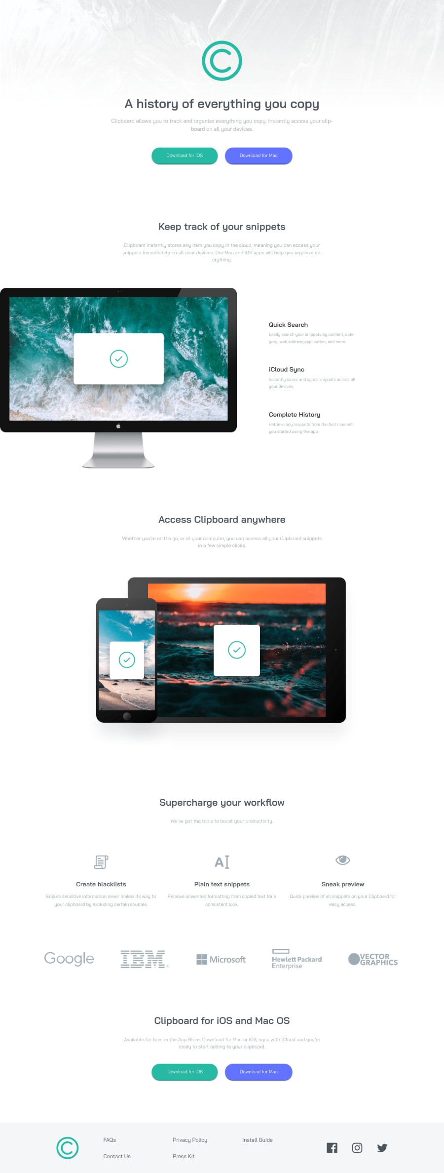
Clipboard Landing Page (Grid CSS) ❤🧐
Design comparison
Solution retrospective
Well, first of all I've been a little busy with a lot of things, but I still finished this project and the ones I'm missing haha 🤷♂️, I really liked this project, it made me review topics that I thought I already mastered as Css grid, the problem of collision of margins and some other issues, however I finished it and I feel I did well. As you know if you have any help to improve my code or design please comment.
Community feedback
- @dxiDavidPosted about 2 years ago
Hi, Ezequiel Córdova Sotomayor! 👋
This solution is awesome, congrats 🎉
I have a few suggestions for you to improve the code
You might want to set the breakpoint a little higher than 490px to allow
  .track__snippets {
    flex-direction: column;
  }
to stack items in that section on top of each other starting at a larger screen size (somewhere around 900px)
You could also try to put the sections inside <main> to avoid the warnings
<main>
    <section class="track">
    <section class="access">
    <section class="workflow">
    <section class="clipboard">
</main>
I hope you find this helpful 😁
Marked as helpful1@3eze3Posted about 2 years ago@dxiDavid Hey thanks a lot for taking the time to improve my code ✔, I really appreciate it and I will keep it in mind for this and future projects.
0 - @vanzasetiaPosted about 2 years ago
Hi, Ezequiel Córdova Sotomayor! 👋
I have some suggestions to improve this solution.
- Add
downloadattribute for each download link. The value of thehrefattribute should point to a file instead of the external link. Also, remove thetarget="_blank". - Alternative text of the logo should be the name of the company—
alt="Clipboard". - Not every image needs alternative text. Decorative images should not have alternative text (
alt=""). This will tell the screen reader to skip over the image. As a result, it saves screen reader users time navigating the page. - For your information, decorative images are images that don't add any information and serve only aesthetic purposes.
- Alternative text for images should not contain any words that are related to "image" (e.g. picture, photo, logo, icon, graphic, avatar, etc). It is already an image element (
<img>) so the screen reader will pronounce it as an image. - Wrap each social media icon with an anchor tag. Then, use the alternative text of the
<img>to label the link.
I hope you find this useful. 🙂
Marked as helpful1@3eze3Posted about 2 years ago@vanzasetia Thanks for the recommendations, they were really helpful for my code and to understand how to improve performance (Regarding images and alt attributes), also thanks for taking the time to help me improve my code.
0 - Add
Please log in to post a comment
Log in with GitHubJoin our Discord community
Join thousands of Frontend Mentor community members taking the challenges, sharing resources, helping each other, and chatting about all things front-end!
Join our Discord
