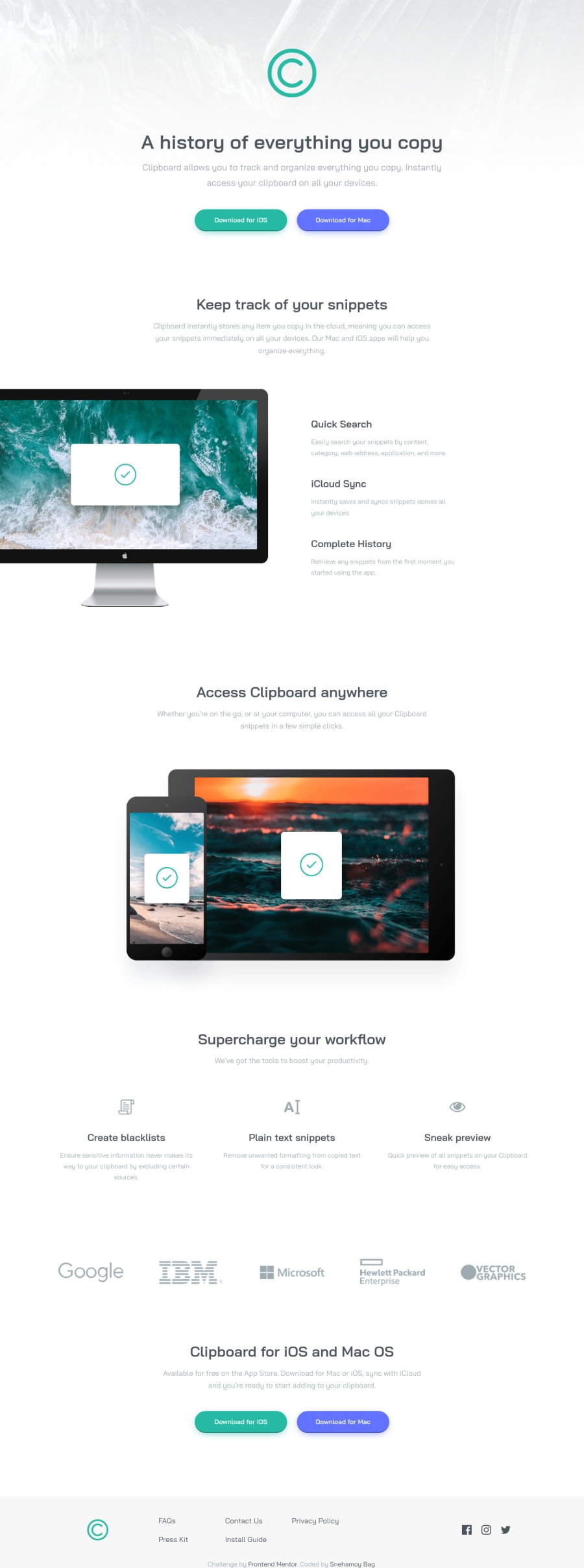
Clipboard landing page using HTML SCSS BEM
Design comparison
Solution retrospective
Hi mentors 🙋♂️
This is my solution to the Clipboard Landing Page challenge. I used the BEM naming convention with SASS/SCSS.
In this challenge I tried to improve the site's accessibility as best as I could.
Apart from the 'features' section the design was quite simple to build.
It'd like to know how can I structure or organize the sass partials and write cleaner and better code 🙇
Thankyou in advance 🙏
Community feedback
- @catherineisonlinePosted about 2 years ago
Love the loading animation part, makes the website look much nicer! I would also add some transitions for hovers 👍
1@snehamoybagPosted about 2 years ago@catherineisonline Thankyou for the suggestion.. I'll definitely try to add some transitions effects in the future projects 🙏
0
Please log in to post a comment
Log in with GitHubJoin our Discord community
Join thousands of Frontend Mentor community members taking the challenges, sharing resources, helping each other, and chatting about all things front-end!
Join our Discord
