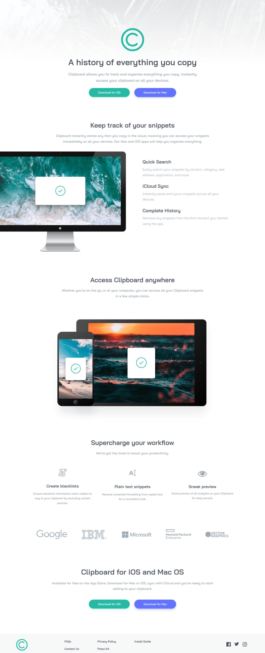
Design comparison
Solution retrospective
Hello everyone, here is the answer to the clipboard landing page master. You are welcome to give suggestions in the comments section. Also, suggest something that would make this webpage responsive for small-screen devices.
Community feedback
- @Ripra87Posted almost 2 years ago
Really nice work, i also just finished this challenge! )) By the way, to make a site responsive you should add a "second" part of code in your CSS. Using the command:
@media screen and (min-width: 1100px) {
}
you can use min-width o max-width, depending from which design you make first (desktop or mobile) and indicate the size of the screen (here 1100px but it can be different) where your page move to the other style.
Inside the pharentesis you should srite the css code with the new rules )) You can check my css code to have an idea.
I hope my comment will help you, by the way really nice projects! Good work and Happy Coding!!
Marked as helpful0 - @VCaramesPosted almost 2 years ago
Hey there! 👋 Here are some suggestions to help improve your code:
Unfortunately, your challenge is not complete since it is not responsive 😢, which is a requirement for this challenge; a
media query
will help. Here is a link to Google Developer’s site that will teach you how make it 100% responsive:- The logo’s
alt tag
description needs to be improved upon ⚠️; it should state the company’s name.
- The “illustrations/icons” serve no other purpose than to be decorative ⚠️; they add no value. Their
alt tag
should left blank to hide them from assistive technology.
More Info:📚
https://www.w3.org/WAI/tutorials/images/
- ⚠️ The company directory needs to wrapped in a
nav
element and be a single list. You will use the CSS propertycolumn
to style it. Each individual link needs to wrapped in ananchor
element.
- Your
CSS Reset
is being underutilized. 😢 To fully maximize 💯 it, you will want to add more to it. Here are some examples that you can freely use 😁: Josh Comeau Reset, Eric Meyer Reset
- For improved accessibility 📈 for your content, it is best practice ✅ to use
rem
for yourfont-size
and other property values. Whileem
is best formedia-queries
. Using these units gives users the ability to scale elements up and down, relative to a set value.
If you have any questions or need further clarification, feel free to reach out to me.
Happy Coding! 🎆🎊🪅
1@packerpotPosted almost 2 years agoHey @vcarames , Thanks a lot, your suggestions are valuable ,I will improve my challenge code as you suggested.
How do I get in touch with you?
0 - The logo’s
Please log in to post a comment
Log in with GitHubJoin our Discord community
Join thousands of Frontend Mentor community members taking the challenges, sharing resources, helping each other, and chatting about all things front-end!
Join our Discord