Submitted over 2 years ago
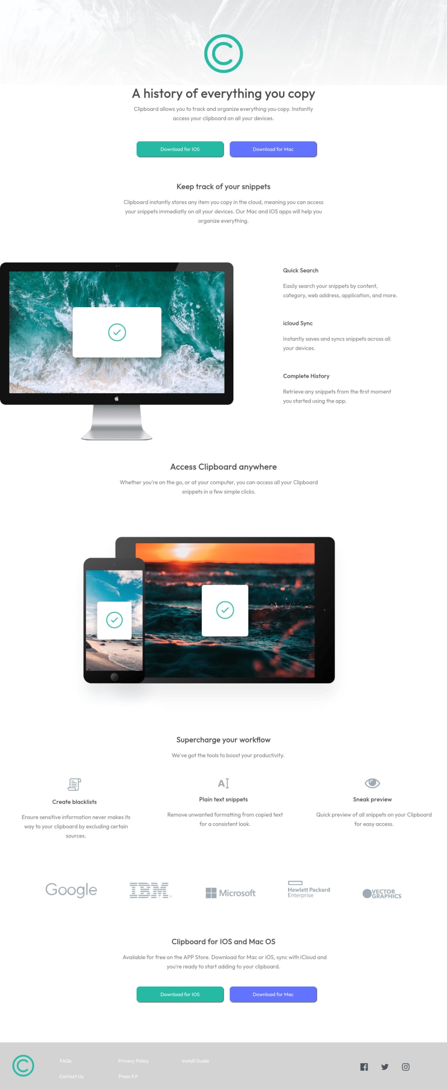
Clipboard landing page CSS grids, flexbox and more.
#accessibility#cube-css
@OkeraM
Design comparison
SolutionDesign
Solution retrospective
I would like to learn a lot more about "Grids" and eventually learn to produce the same amount of code with less code. For example, I had an issue aligning text in the footer to the left side, because of this, what I did was just add width to grid-item-1 and grid-item-5. I also did this with a couple of other elements such as paragraph tags. I don't want to do this again, I'm sure there is an easier way.
Community feedback
Please log in to post a comment
Log in with GitHubJoin our Discord community
Join thousands of Frontend Mentor community members taking the challenges, sharing resources, helping each other, and chatting about all things front-end!
Join our Discord
