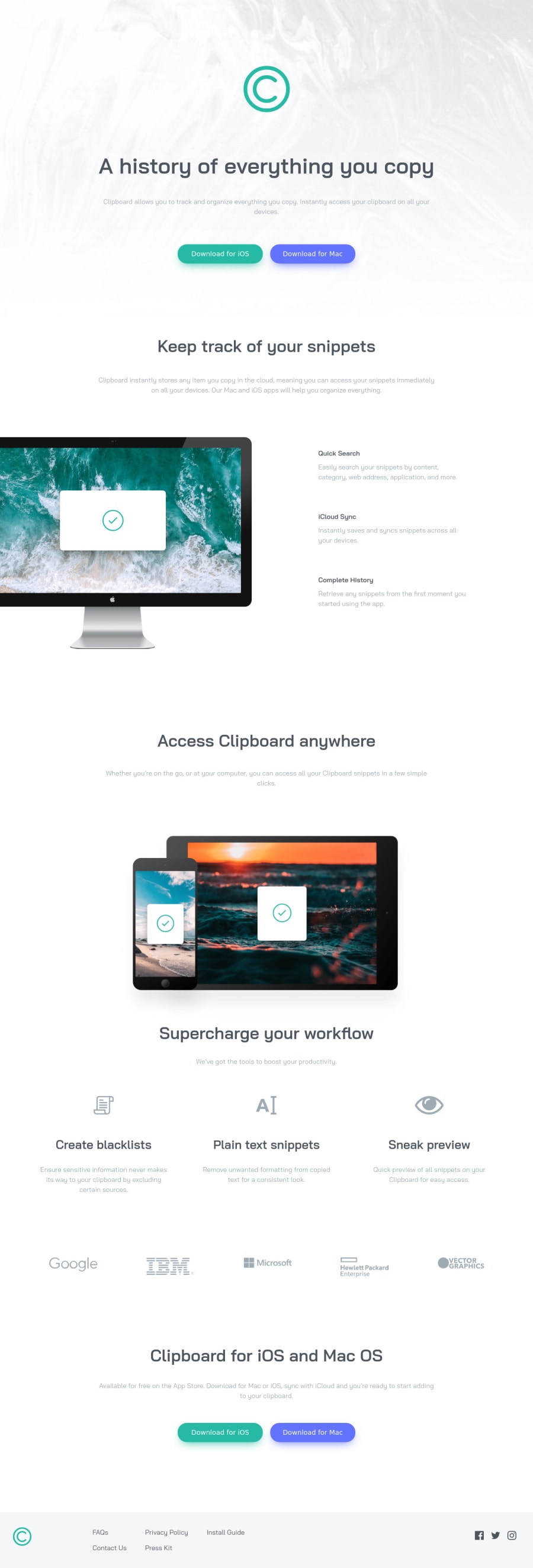
Design comparison
SolutionDesign
Solution retrospective
Hello!
I appreciate any recommendation. Thanks
Community feedback
- @vanzasetiaPosted almost 3 years ago
👋 Hello there, StrigZ!
🎉 Congratulations on finishing this challenge! 👍 Good job on making this responsive on both mobile and desktop.
One thing that I notice is when the width of the screen starts becoming too wide (e.g. 1920px), the content gets separated too far. So, to fix this you can create a
containerthat hasmax-widthon it.More feedback:
- Accessibility
- 👍 Good job on using landmark, but I would expect something like this:
<body> <main> <section class="hero"> <img class="history__logo" src="./images/logo.svg" alt="Clipboard"> <h1 class="history__title">A history of everything you copy</h1> <p class="history__desc">Clipboard allows you to track and organize everything you copy. Instantly access your clipboard on all your devices.</p> <div class="history__buttons"> <a download href="/" class="btn btn-green">Download for iOS</a> <a download href="/" class="btn btn-blue">Download for Mac</a> </div> </section> </main> <footer> </footer> </body>- Let me explain the above code.
- First, there's no need for
header.headerelement is commonly used to wrapnavelement. In this case, there's no navigation. - Second, the
sectionwithh1and the logo is a section, not a header. It's commonly called the hero section. - Third, for the logo, you can use the company name as the alternative text. Also, alternative for image should contain any words that related to "image" such as picture, icon, graphic, logo, etc. The screen reader will pronounce it as an image and the user of screen reader will know that it is a logo (the same as the sighted user see it).
- Last but not least, the download buttons should not be
buttonelements. It should beaelements withdownloadattribute.
- First, there's no need for
- The
<section class="track">and<section class="features-1">should be in onesectionelement. Keep in mind that everysectionshould have a heading tag.
<section class="track"> <h2 class="track__title">Keep track of your snippets</h2> <p class="track__desc"></p> <img class="features-1__img" src="./images/image-computer.png" alt="" aria-hidden="true"> <ul class="features-1__features"> <li> <p>Quick Search</p> <p>Easily search your snippets by content, category, web address, application, and more.</p> </li> ...more code below- Let me explain the above code.
- First, for any decorative images, each
imgtag should have emptyalt=""andaria-hidden="true"attributes to make all web assistive technologies such as screen reader ignore those images. In this case, all images are decorative only, except the logo and social media icons. - Second, I changed the
h3topbecause the content below it is too small. - The last thing, I would recommend swapping all the
h3inside thelielement withptag.
- First, for any decorative images, each
- Add
aria-label="Facebook"to thesvg(social media icons) elements as the text content of it. - Remove the
xmlnsattribute from thesvgtag. SVG and MathML can be used directly in an HTML document. - Styling
- Use
remor sometimesemunit instead ofpx. Usingpxwill not allow the users to control the size of the page based on their needs.
- Use
That's it! Hopefully, this is helpful!
Marked as helpful0 - Accessibility
Please log in to post a comment
Log in with GitHubJoin our Discord community
Join thousands of Frontend Mentor community members taking the challenges, sharing resources, helping each other, and chatting about all things front-end!
Join our Discord
