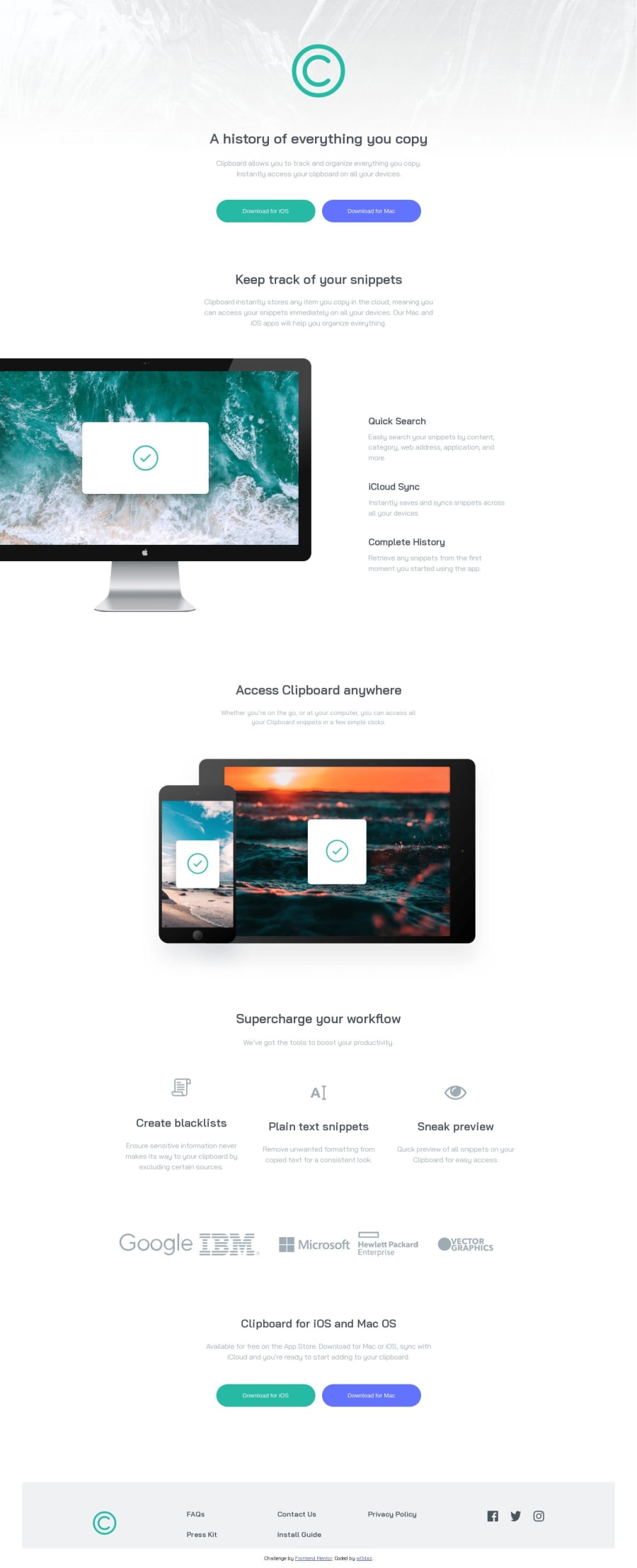
Design comparison
Solution retrospective
I didn't figure out how to add shadows to the buttons. Any suggestions please? Also how do I get the width to correlate with the browsers'?
Please feel free to leave any other comment or suggestions for improvement. Your feedback is greatly appreciated.
Thanks for taking the time to visit.
Community feedback
- @ChamuMutezvaPosted over 1 year ago
Hi W0DAZ.
Here is some of my observations when I went through your work:
- when writing the alt value of images, the point to take is the context of the message in the image and some words like logo, image, picture should be left out as that is an obvious case. Alt values can be used when the image fails to load and by search engines, so if the image fails to load will the message/content be recieved in the best possible way by the user. Decorative images , yes should have an empty value - but lets take an example of the sponsors section where all the sponsors are representated by images with an empty alt value. That message will not be recieved by Assistive Technology users , I believe it is a vital information of the site.
- A best recommendation for the h1 heading , is to have one h1 heading per page. You can read more here on mdn h1 heading elements
- On the download buttons, what are your expectation when the button is clicked, does the button navigate to another site for the downloads or does it opens something like a modal. If it is navigation to another page, section or site then that means that instead of a button you should have used an anchor element. Maybe that is the reason you wrote your click events as
onclick="location.href='#'"
- In the footer sections , you have these
p
elementsfaq, contact us, install guide
etc. Those too should have been links - I would expect some sort of navigation to take place. For better accessibility, I would wrap the links in an unordered list. - The footer icons
facebook, twitter, instagram
, in my opinion , should be links to those social platforms - they are not there to display the images. - check on a modern css reset, I would refer you to the one by Andy bell.
- While you have used media queries , the site is not responsive. Use Devtools to view it from 375px going up. Some of the reasons includes , having some fixed width on elements and some margin values (some big) that are being used to try to control the positioning of elements. I have noted that you have taken some of the easier challenges like the Qr card component - if your didn't recieve feedback on those challenges , you need to repost them so that you can be guided accordingly. Those challenges helps you to see how best to deal with the current layout issues.
Happy coding
Marked as helpful0@w0dazPosted over 1 year ago@ChamuMutezva thanks for the feedback. i've effected most of the changes proposed. to answer your question:
-the download button is not supposed to link to anything (that is, according to the design guidelines provided by frontendmentor). but if the goal is to link it to another page the onclick event does work doesn't it?
-what other headings should i use? or should i make them p elements instead. because someone advised me not to use h2 headings when i attempted to limit my usage of h1's...
-this part is my primary concern because i want to get a hang of it before i move on to other complex challenges: how do i leave gaps between elements without using margins and how do i size the img elements without setting a specific width size?
0@ChamuMutezvaPosted over 1 year ago@w0daz
- the designs usually will not cover everything that you need but will give you a general idea - that is in reference to the button. Like I said above
href
is a property that is associated with the link (anchora
) element not a button. My expectation here is that it should be an anchor element . - headings - check the link that I provided above on heading elements - MDN . Some of the points indicated shows that the first heading element should be an h1 element and for best practice you should have only one h1 element - and reasons which include accessibility and SEO are given. After an
h1
, the next heading element will be an h2 (do not skip heading elements). Depending on the organisation of your html the next heading element in line will be an h3 - but if the elements are in the same hierachy then some headings may be repeated. For instance
- h1
A history of everything you copy
-
h2 `Keep track of your snippets`
-
h3 `Quick Search`
-
h3 `iCloud Sync`
-
h3 `Complete History`
-
h2 `Access Clipboard anywhere`
-
h2 `Supercharge your workflow`
-
h3 `Create blacklists`
this is just to give you an idea , so you have to work around it. What was the reason given not to use h2 heading elements?
- for spacing margins and paddings are ok to use , but if the margins are being changed repeatedly and getting bigger and bigger , they maybe other ways to fix that. Sometimes I play around with
max-width
and/orwidth
of an element and supported with a margin auto. Images - , some issues are covered by having a css reset , images are reset as
/* Make images easier to work with */ img, picture { max-width: 100%; display: block; }
As mentioned before , I would encourage you to submit the Qr code challenge for review so that most of these things can be exhausted using a single component, from there on , it will be a matter of building from there
Marked as helpful0@w0dazPosted over 1 year ago@ChamuMutezva oh wow. okay. i'll make the changes as you've instructed. i was looking for a workaround because this would involve correcting the styles as though but i guess there's no avoiding that...
i have done the qr code component challenge. here's a link to the challenge: https://www.frontendmentor.io/solutions/qr-code-component-challenge-8SfNFVYS9I
I could make another attempt at the challenge if that's what you're asking me to do.
0@ChamuMutezvaPosted over 1 year ago@w0daz, post it in the discord channel #finished-projects, so that you can widen your chances of feedback. It is always good to hear views from different people and their approach.
Marked as helpful0@w0dazPosted over 1 year ago@ChamuMutezva alright, i'll post it on the discord channels...
i've effected all the changes you proposed. can you please take another look at the code?
0
Please log in to post a comment
Log in with GitHubJoin our Discord community
Join thousands of Frontend Mentor community members taking the challenges, sharing resources, helping each other, and chatting about all things front-end!
Join our Discord