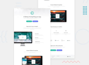
Design comparison
Solution retrospective
Feedbacks are appreciated.
Community feedback
- @brasspetalsPosted almost 4 years ago
Hi, Vishal! 👋 Excellent job on this solution - it matches the design quite well and responds nicely. Here’s a few suggestions to make it even better. 😄
-
To clear up the accessibility errors in your report, add
titletags to your social icons. -
For “The element button must not appear as a descendant of the a element” errors - here your “buttons” are technically links styled to look like buttons, but don’t use any button functionality. You could actually remove the button tags and just add your styling/class to the
atags instead. -
Using “h#” tags (
h1, h2, h3,etc.) for your headings instead ofptags will clear up the “Section lacks a heading” errors and also make your solution more semantically correct. Here’s a great article that talks about this (and a lot of other HTML semantics) that I’ve found super helpful. -
On very large screens, the top background image doesn’t fill the entire width. This can be easily fixed by adding
background-size: contain;to the body. -
When transitioning to the medium layout at 775px, the footer logo gets very small. One way to fix this by is by adding a
min-width. -
To better match the design, you could also add a
max-widthto the “Access Clipboard” div you have the image set on . You may have to add a few extra lines of code to make sure it stays centered, however.
Hope this was helpful. Keep up the good work, and happy coding!
1 -
Please log in to post a comment
Log in with GitHubJoin our Discord community
Join thousands of Frontend Mentor community members taking the challenges, sharing resources, helping each other, and chatting about all things front-end!
Join our Discord
