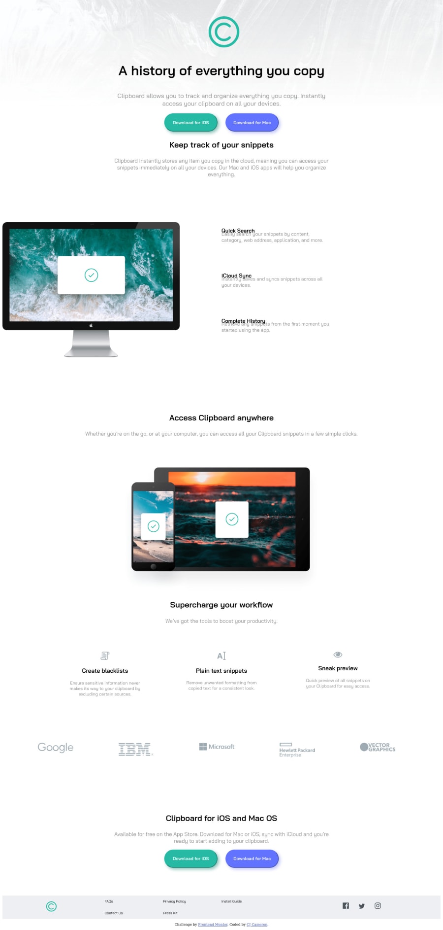
Design comparison
Solution retrospective
I feel like I got very comfortable manipulating CSS Grid with this one. Also my first time creating a mobile version of a site that I am pleased with. All suggestions and advice welcome!
Please log in to post a comment
Log in with GitHubCommunity feedback
- @ApplePieGiraffe
Hey, CJ Cameron! 👋
Good effort on this challenge! 👍
A few things I'd like to suggest are,
- Removing the border around the download buttons in the page.
- Adding
alttext to any images that are important and should have their description read by screen readers. For images that aren't important to the content of the page, add analtattribute but leave the text empty. - Turning the social media links in the footer of the page into actual links by wrapping each of them in a link tag. You may also want to add some screen reader-only text inside those links or add an `aria-label` attribute to them instead to make sure they can be identified by screen readers.
- Using less
vwunits in your code for things likewidthandfont-size. Specifying values such as `margin`, `padding`, `font-size`, and in a better responsive unit such as `em` or `rem` (not `px`, which is a fixed unit) will ensure that changing the font-size of the document causes the rest of the site to scale up/down (which is important for accessibility reasons). To learn more about `em` and `rem`, see this. - Using heading tags (such as
h1orh2, etc.) for the headings of sections in the page.
Hope this helps. 😊
Keep coding (and happy coding, too)! 😁
Marked as helpful
Join our Discord community
Join thousands of Frontend Mentor community members taking the challenges, sharing resources, helping each other, and chatting about all things front-end!
Join our Discord
