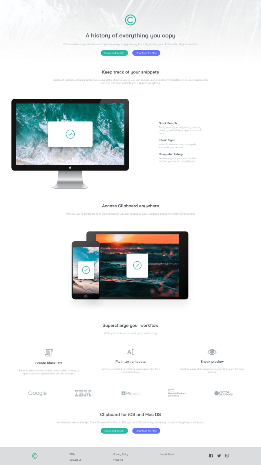
Design comparison
SolutionDesign
Solution retrospective
How can I make my site look pleasing? When I see the output on localhost it looks fine but when hosted with Github, it shows small fonts and everything small on the same screen as compared to the local host.
Feedbacks are appreciated. Thanks.
Community feedback
Please log in to post a comment
Log in with GitHubJoin our Discord community
Join thousands of Frontend Mentor community members taking the challenges, sharing resources, helping each other, and chatting about all things front-end!
Join our Discord
