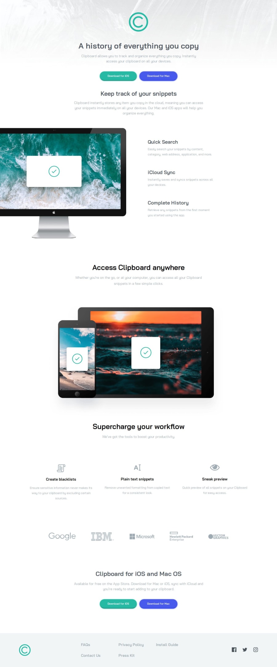
Design comparison
Solution retrospective
I'm most proud of the clean and visually appealing design of the Clipboard landing page. The layout and styling came together seamlessly, effectively highlighting the features and functionality of the page.
Moving forward, I would concentrate more on ensuring the landing page is fully responsive. Although it currently looks impressive on larger screens, I acknowledge the need for improvement to optimize its display on smaller devices. Furthermore, I aim to incorporate additional interactive elements to enhance user engagement with the page.
What challenges did you encounter, and how did you overcome them?The main challenge I faced was changing the fill color of the SVG of the social icons. Through this, I learned a great deal about SVGs.
One of the main challenges I encountered was making the Clipboard landing page fully responsive to cater to different screen sizes. It required experimentation and adjustments to strike a balance between responsiveness and maintaining the page's aesthetic appeal.
To tackle this challenge, I employed media queries and flexible layout techniques in CSS to ensure the landing page adapts seamlessly to varying screen dimensions. Rigorous testing on diverse devices was also crucial to verify the page's consistent display across different platforms.
What specific areas of your project would you like help with?I would greatly appreciate feedback on the responsiveness of the Clipboard landing page, particularly on smaller screens. Additionally, suggestions on enhancing user interaction and engagement within the landing page would be highly valuable. Thank you for your insightful input!
Community feedback
Please log in to post a comment
Log in with GitHubJoin our Discord community
Join thousands of Frontend Mentor community members taking the challenges, sharing resources, helping each other, and chatting about all things front-end!
Join our Discord
