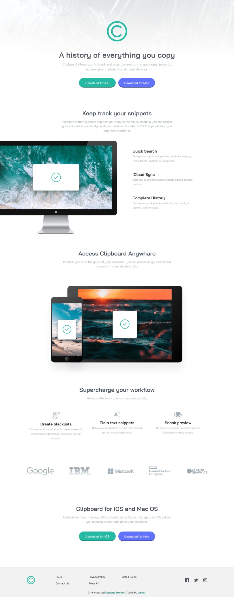
Design comparison
Solution retrospective
My English is bad. Sorry in advance.
A very simple and straight-forward landing page, nothing much to say but there's something that piqued my interest, The navigation bars inside the footer are arranged from top to bottom, then wrap to the left, instead of left to right, then wrap down.
My initial solution for this is to use flex -> column -> wrap
, but to automatically wrap the elements, the the height of the parent element must be set. Tho this works, I still need to set a height or max-height on the parent element for each breakpoints.
But what I want is to auto-wrap the elements like in Flex without setting the height of the parent element. I know that Flex columns work fine, but I just want the height of the footer to be auto-adjusted.
I just want to ask the community if there's another way to do this.
As always, feel free to comment any suggestion/tips. Thaaanks!
Community feedback
- @sahand-masolehPosted about 2 years ago
Hi lieneil! Really good solution!
About your question, you can also use a grid with
grid-auto-flow: column
and then setting yourgrid-template-columns
to repeat withauto-fit
.Also, don't use height: 100vh on your pages because the moving address bar of mobile browsers is included in it and it will push everything down. Use
height: 100%
on the "parents" of the element that you want to cover the page, and thenmin-height: 100%
on that element.Nevertheless, you don't even need that for this page, since it doesn't have a vertically centered element.
One more thing, you don't need to set
height: auto
on elements, it is by default set to auto.Marked as helpful0@NJVSPosted about 2 years agoHi @sahand-masoleh, thanks for the reply.
I have seen your solution for this challenge and tried what you have done. I actually just copy your code coz this is the first time i've seen this...
grid-template-columns: [first] minmax(min-content, 15ch) [second] repeat( 3, minmax(min-content, 15ch) ) [second-to-last] auto [last];
Tho im still sticking with my solution because it automatically add a new row on tablet mode without media query.
BTW, about the address bar of mobile, i didn't know about that. I rarely test my solutions to an actual mobile phone. Thanks, i learned a lot from you.
0@sahand-masolehPosted about 2 years ago@NJVS Haha, it's from a few months ago so I don't really remember what I did. :D
But those brackets are track names, when you use repeat and you don't know what track number you will need, you can give it a name and use that instead.
Marked as helpful1 - @AdrianoEscarabotePosted about 2 years ago
Hi lieneil, how are you?
I really liked the result of your project, but I have some tips that I think you will enjoy:
- The links must have an aria-label or sr-only text that tells where the link navigates the user. For example: Visit our Facebook. For images, you should set aria-hidden=”true” to be ignored by screen readers and to avoid redundancy and repetition.
I looked at your code here and realized that you forgot to delete the content without the tags, go down the code and you'll understand what I'm talking about ahauahua
The rest is great!
I hope it helps... 👍
Marked as helpful0@NJVSPosted about 2 years agoHi @AdrianoEscarabote, thanks for the reply.
I just started reading articles about web accessibility, and I was planning to implement it in my future solutions. Do you have any recommended articles or videos for this?
And yeah, i forgot to delete those comments lol thanks.
0
Please log in to post a comment
Log in with GitHubJoin our Discord community
Join thousands of Frontend Mentor community members taking the challenges, sharing resources, helping each other, and chatting about all things front-end!
Join our Discord