Design comparison
SolutionDesign
Solution retrospective
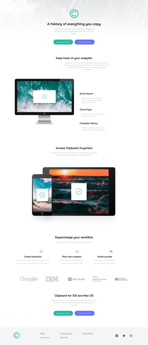
I getting a bit better at flexbox but still need some work. I also noticed that when you click on the social links they all highlight I will go back and fix it but other than that any tips and comments on how I couldve done it better helps
Community feedback
- @vanzasetiaPosted almost 2 years ago
Hi, Kevin Koziol! 👋
First, you need to put the
<meta>
viewport tag below the<meta charset="utf-8">
. It is a piece of information that browsers need to find as soon as possible.Some other suggestions from me.
- Alternative text for images should not contain any words that are related to "image" (e.g. picture, photo, logo, icon, graphic, avatar, etc). It is already an image element (
<img>
) so the screen reader will pronounce it as an image. - Add
download
attribute to each download button. - Not every image needs alternative text. Decorative images should not have alternative text (
alt=""
). This will tell the screen reader to skip over the image. As a result, it saves screen reader users time navigating the page. - For your information, decorative images are images that don't add any information and serve only aesthetic purposes.
- Wrap each social media icon with an
<a>
. It is a social media link of the company so it should be wrapped by an anchor tag. - Put the
<footer>
outside the<main>
landmark. Otherwise, the<footer>
will not have semantic meaning.
I hope this helps. 🙂
1 - Alternative text for images should not contain any words that are related to "image" (e.g. picture, photo, logo, icon, graphic, avatar, etc). It is already an image element (
Please log in to post a comment
Log in with GitHubJoin our Discord community
Join thousands of Frontend Mentor community members taking the challenges, sharing resources, helping each other, and chatting about all things front-end!
Join our Discord