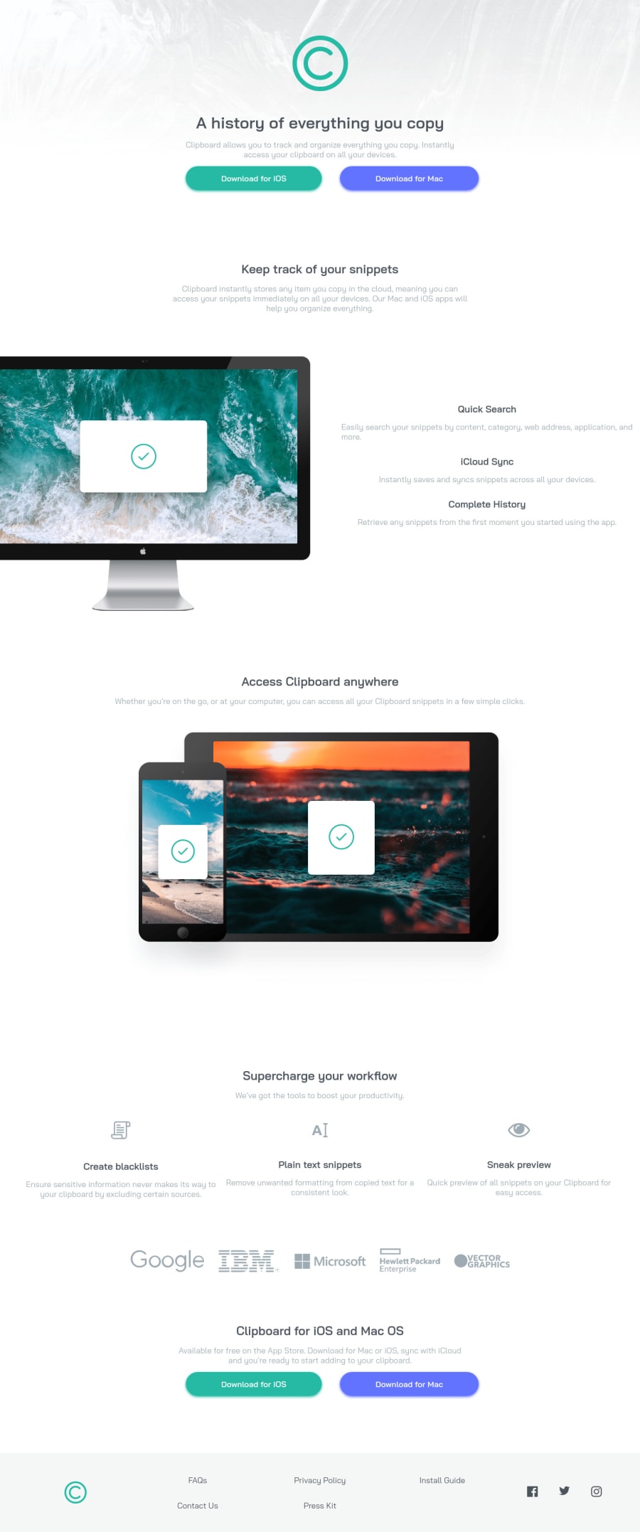
Design comparison
Solution retrospective
I was having trouble trying to align a portion of text to the left under one of the media queries (the text next to the desktop image). It has a comment next to it in the code, I tried the justify and align properties but they didn't help and I'm not sure why. Is there another line somewhere with higher priority?
Any other advice or criticisms welcome, thank you!
Community feedback
- @LemirqPosted over 2 years ago
Hello Ahmet, Great Solution!
To answer your question, the
.subsection--2 .sub-containeris already aligning to the left side. The issue is that the description is taking the entire space that is there, giving the illusion that it is centered. You can add amax-widthproperty to.subsection--2 .sub-containerto restrict the amount of space it uses. If you wanted to align the subtitles of those to the left, try removingmargin-inline: auto;from.main-container *.Cheers!
Marked as helpful1@akyanuPosted over 2 years ago@Lemirq Thank you! I didn't realize .main-container * was the thing preventing the subtitles from going left. I thought * only effected .main-container's children, not it's grandchildren too. Good to know for the future!
0
Please log in to post a comment
Log in with GitHubJoin our Discord community
Join thousands of Frontend Mentor community members taking the challenges, sharing resources, helping each other, and chatting about all things front-end!
Join our Discord
