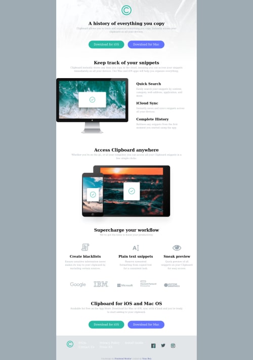
Clipboard landing page

Solution retrospective
Hi everyone,
I just completed this challenge. I use flexbox CSS. Here are where I had difficult in these challenge :
- Change the color on the social medias icon (Facebook, Twitter, Instagram) when we hover on icon. =>What I did is to download other icons social media in color cyan blue and I put them on CSS in background like this : `.social-media-ig a, .social-media-fb a, .social-media-tw a{ display: inline-block; margin:1rem; }
.social-media-fb a { background: url('images/facebook-square-custom.svg') no-repeat; }
.social-media-tw a{ background: url('images/twitter-custom.svg') no-repeat; }
.social-media-ig a{ background: url('images/instagram-custom.svg') no-repeat; }
.social-media-fb a:hover img, .social-media-tw a:hover img, .social-media-ig a:hover img { visibility: hidden; }
But I am not satisfied by the result because we see 2 icons one above the other.
-
On the footer, I didn't know how to put the FAQs, Privacy Policy, Press kit.. as it appears in the challenge. Here is my solution.. But I know, it's not perfect : ` <div class="links"> <img class="logo-C-bottom" src="images/logo.svg" alt="">
 <div class="faqs">
   <a class="hover-links" href="#">FAQs</a>
   <br>
   <a class="hover-links" href="#">Contact Us</a>
 </div>
 <div class="privacy">
   <a class="hover-links" href="#">Privacy Policy</a>
   <br>
   <a class="hover-links" href="#">Press Kit</a>
 </div>
Your feedbacks and suggestions are welcome !! Thank you very much and happy coding !!
Best regards, Yous Ben
Please log in to post a comment
Log in with GitHubCommunity feedback
No feedback yet. Be the first to give feedback on Yous's solution.
Join our Discord community
Join thousands of Frontend Mentor community members taking the challenges, sharing resources, helping each other, and chatting about all things front-end!
Join our Discord