Design comparison
SolutionDesign
Solution retrospective
it's the first solution for me. Feel free to give feedback!
Community feedback
- @rohailtahaPosted almost 5 years ago
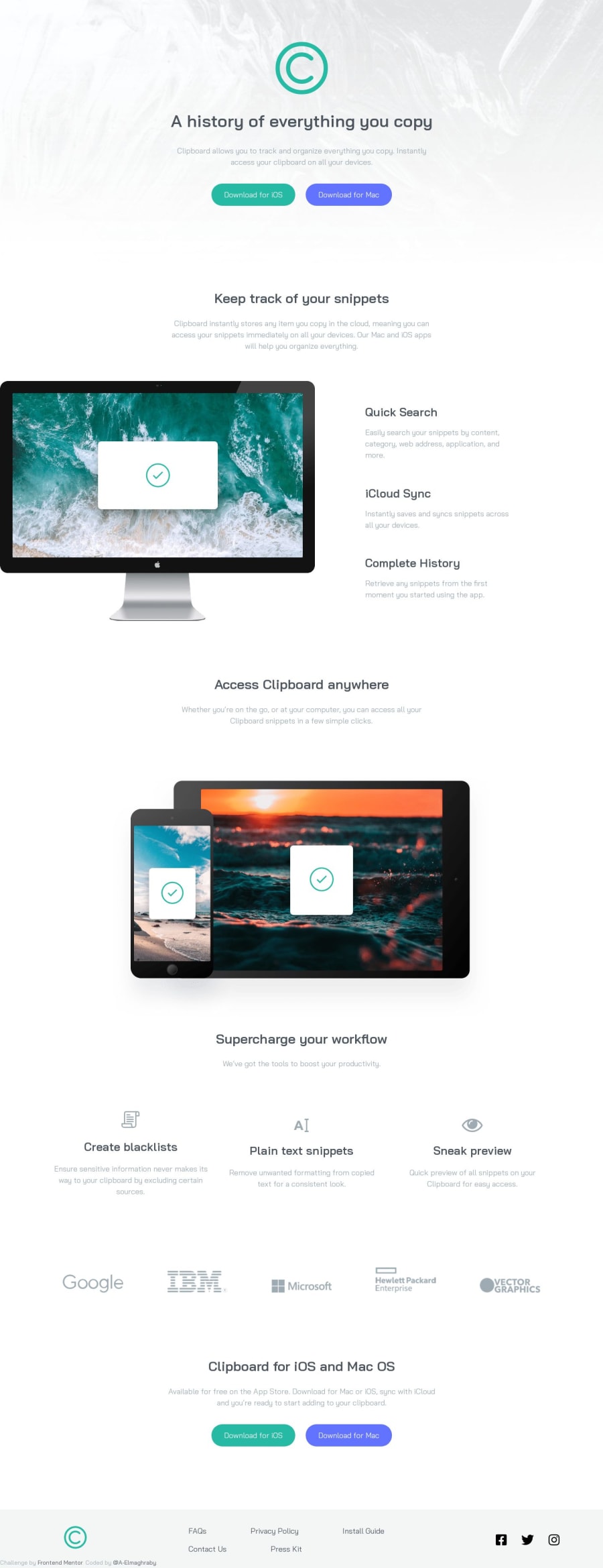
Awesome. If you gave the "desktop image" a small negative margin from left, the image would be cut off from the left a bit and look more like the original. But the page is cool. Keep it up.
0 - @DevEarliPosted almost 5 years ago
Pretty nice
0
Please log in to post a comment
Log in with GitHubJoin our Discord community
Join thousands of Frontend Mentor community members taking the challenges, sharing resources, helping each other, and chatting about all things front-end!
Join our Discord
