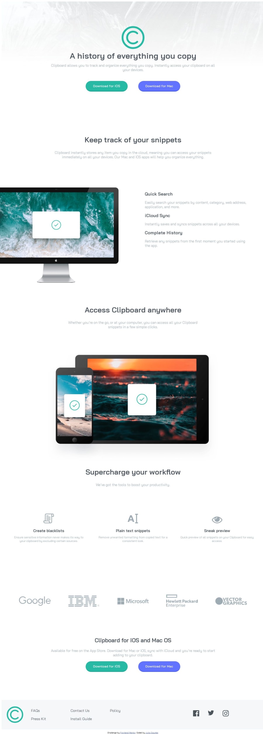
Design comparison
Solution retrospective
Id love to have someone go over my code and give me a few pointers what to look out for. So if anyone has time that would be greatly appreciated!
Community feedback
- @matiasluduena23Posted over 1 year ago
Hi Jewels’s! Your work looks great! I'm will copy that buttons border-bottom to my project I forget about it and looks nice.
Just one recommendation that might help you.
- If you notice in the top of your layout there is a white line, that is because is applying the default margin. Maybe you don't see it. Because is different in each browser. To avoid that make a reset in your css file:
*, *::after, *::before {
  margin: 0;
  padding: 0;
  box-sizing:border-box;
}
Good code!
Matias
0@ShalomiAhavahPosted over 1 year ago@matiasluduena23 Hey! Im glade my buttons idea is helpful to you lol. Mainly came about because i hate the box shadow story but oh well. That line was irritating me so bad 🙈 thanks for the tip!
1
Please log in to post a comment
Log in with GitHubJoin our Discord community
Join thousands of Frontend Mentor community members taking the challenges, sharing resources, helping each other, and chatting about all things front-end!
Join our Discord
