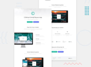
Design comparison
SolutionDesign
Solution retrospective
Any advice is welcome
Community feedback
- @vanzasetiaPosted almost 2 years ago
Hi, Miguel!
It is a good solution and can be better if you:
- Add alternative text to all the logos.
- For images containing text, make sure the alternative text includes the image's text. For example, the Google logo should have an
altvalue of “Google”. Reference — Checklist - The A11Y Project #for-images-containing-text-make-sure-the-alt-description-includes-the-images-text - Add
downloadattribute to each download button. - Give an accessible name to each of the social media links. You can use
aria-labelto do that. - Remove
min-width: 375px;andmax-width: 1440px;from the<body>styling. Those stylings make the<body>element not responsive on some screen sizes. - Never use
pxunit for font sizes. Useremoreminstead. Relative units such asremandemcan adapt when the users change the browser's font size setting. - Add
* { box-sizing: border-box }as part of the initial or reset styling. This way,paddingwon't add more width to the element. - Adjust the media query breakpoint.
1440pxis too late for desktop styling. Also, not all desktop devices have that screen size. - Remove
max-width: 2000px;from the<body>styling. It should always fill the entire page. Treat it as the main element of the web page. - Prefer unitless numbers for line-height values to avoid unexpected results. Learn more — line-height - CSS: Cascading Style Sheets | MDN
I hope this helps. Happy new year!
Marked as helpful0
Please log in to post a comment
Log in with GitHubJoin our Discord community
Join thousands of Frontend Mentor community members taking the challenges, sharing resources, helping each other, and chatting about all things front-end!
Join our Discord
