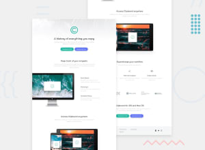
Design comparison
Solution retrospective
Thank you for checking my solution. I don't really know about the CSS best practice and I think that the quality of my code is pretty bad so please leave any feedback if you have. Thanks! You can connect me on twitter(https://twitter.com/rai_jenis) I will follow you back.
Community feedback
- @grace-snowPosted almost 4 years ago
Hi,
This looks pretty nice to me (viewing on mobile). I've only looked at html so far and there are some improvements I can suggest ☺️
- start headings at h1 and then keep in order down the page. It's important to have one h1 on every page. Then your existing h3s would become h2s. And you mustn't jump like you have at the moment to h5s - those would become h3s. (they can all keep existing styling)
- when you do alt text you don't need to say words like "image of" as they are already announced as images because they are image elements.
- in the footer the logo has
alt="logo"but that is not an accurate description. It should say the name of the product instead. - make sure links always have aria-labels if their only contents is an image/icon
I hope this is helpful. Overall its well structured and easy to understand html, you've done a good job with it
2@Jenis313Posted almost 4 years ago@grace-snow Hi, Thank you so much for such valuable feedback I really appreciate it.
0
Please log in to post a comment
Log in with GitHubJoin our Discord community
Join thousands of Frontend Mentor community members taking the challenges, sharing resources, helping each other, and chatting about all things front-end!
Join our Discord
