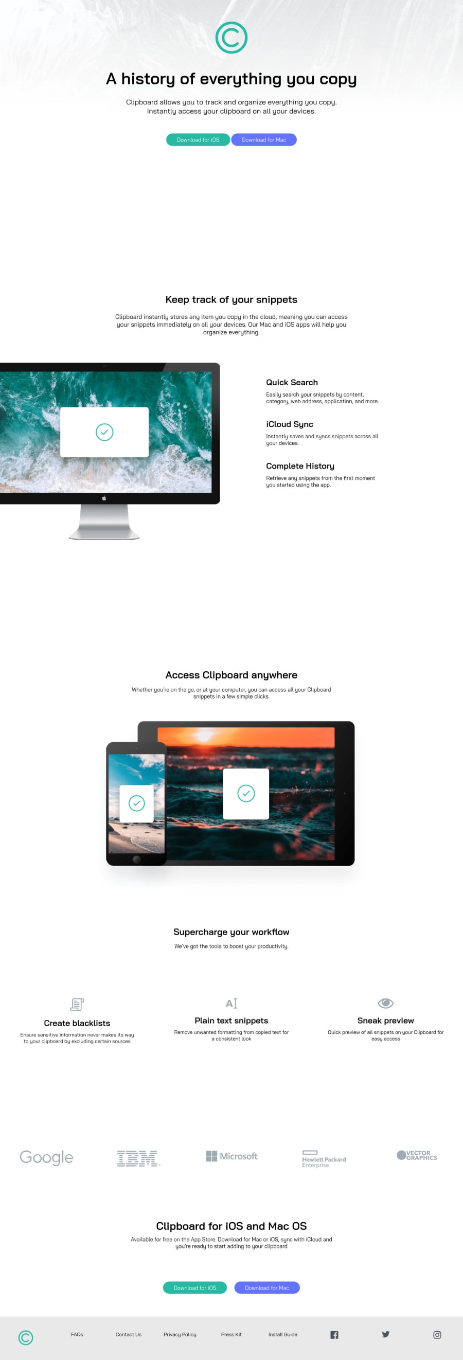
Design comparison
SolutionDesign
Solution retrospective
Third challenge i've done, i would say this went crazy, really nice, it literally took some days to get it done, and, yeah... felt pretty good doing it, but if something looks wrong, let me know and tell me how i can improve my work, i'm still learning, and please, from 0 to 10 how good my work was?
Thank you comunnity ! :'3
Community feedback
- @Diego-MikePosted almost 4 years ago
Cool, apreacciate that, next time i'll aply that to my projects !
0 - @ApplePieGiraffePosted almost 4 years ago
Hey, Diego-Mike! 👋
Good work on this challenge! 👍 The animation you added to the icons in the features section of the page was a cool touch! 😎
I suggest,
- Adding a hover state to the various buttons of the page and the navigation links in the footer of the page.
- Decreasing the space between the hero section and the "Keep track of your snippets" section and the "Keep track of your snippets" section and the "Access clipboard anywhere" section (there's quite a bit of extra room between those sections in the mobile layout of the site).
- Turning the social media links in the footer of the page into actual links using the anchor tag.
Keep coding (and happy coding, too)! 😁
0
Please log in to post a comment
Log in with GitHubJoin our Discord community
Join thousands of Frontend Mentor community members taking the challenges, sharing resources, helping each other, and chatting about all things front-end!
Join our Discord