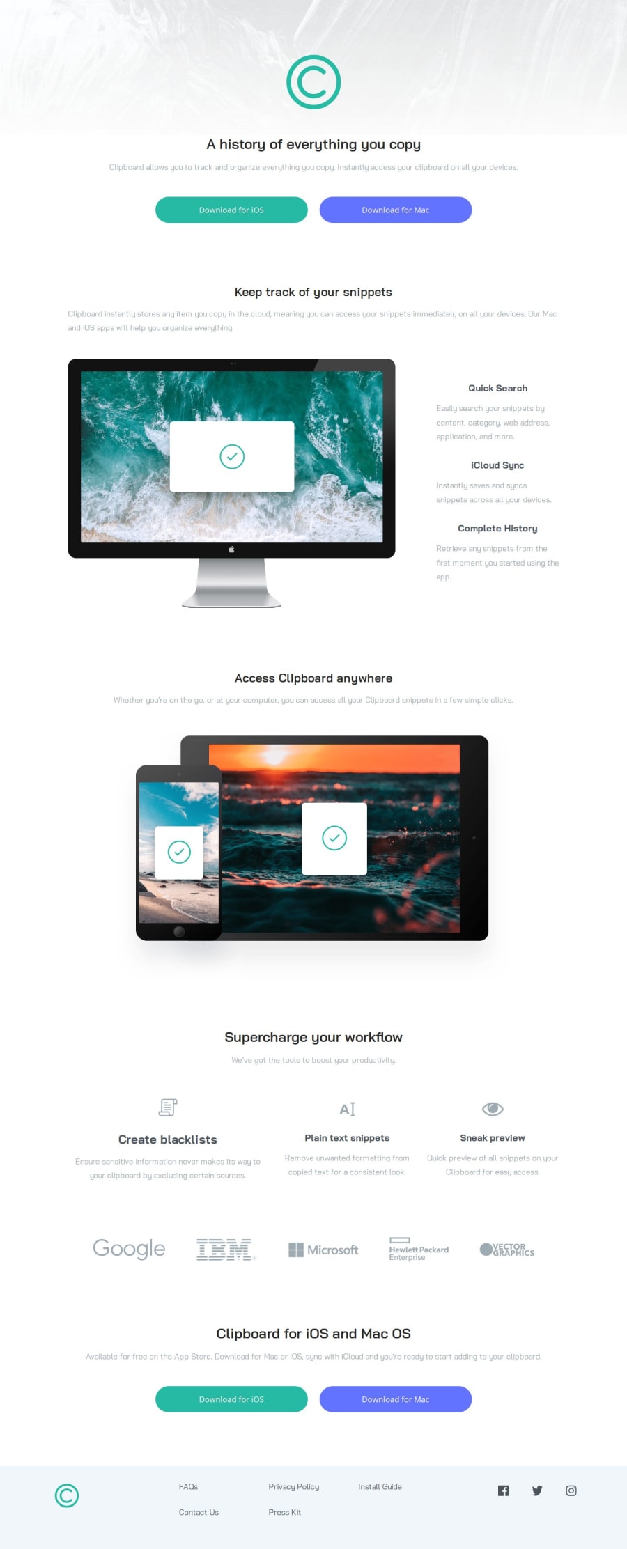
Design comparison
Solution retrospective
I am most proud of successfully implementing a responsive design that works well across various devices. Utilizing Flexbox and CSS Grid allowed me to create a flexible and adaptive layout, ensuring a smooth user experience on both small and large screens. I also take pride in the organized structure of my HTML and CSS, which makes the code easy to read and maintain.
Next time, I would focus more on accessibility features to ensure the website is usable for people with disabilities. This includes adding ARIA roles, ensuring better color contrast, and making sure all interactive elements are keyboard accessible. Additionally, I would consider using a CSS preprocessor like SASS to make my CSS more modular and maintainable.
What challenges did you encounter, and how did you overcome them?One of the main challenges I faced was dealing with a horizontal scrollbar on small devices. This issue was caused by elements overflowing the viewport, which disrupted the layout and user experience.
I overcame this challenge by carefully inspecting the elements that were causing the overflow. Using CSS properties like max-width: 100% and ensuring that all elements were contained within their parent containers helped resolve this issue
What specific areas of your project would you like help with?Accessibility Improvements: Guidance on how to enhance the accessibility of my website would be beneficial. This includes using ARIA attributes, improving color contrast, and ensuring that all interactive elements are accessible via keyboard navigation.
Community feedback
Please log in to post a comment
Log in with GitHubJoin our Discord community
Join thousands of Frontend Mentor community members taking the challenges, sharing resources, helping each other, and chatting about all things front-end!
Join our Discord
