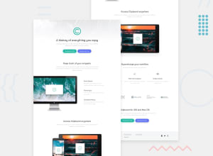
Design comparison
SolutionDesign
Solution retrospective
all feeback is welcome 😎
Community feedback
- @vanzasetiaPosted over 2 years ago
Hello there! 👋
Congratulations on finishing this challenge! 🎉
We need to get the HTML right first.
- The alternative text of the logo should not be "logo". It should be the company name. The logo is one of the ways for screenreader users to know about the name of the site or project. If the alternative text is "logo" then the users can assume that it is a logo website instead of Clipboard website.
- The download buttons should be anchor tags with
downloadattribute. - Not all images need alternative text. Try to disable all the images. For example, if the logo of the website doesn't exist then the users might not know the name of the site. Another example is if the
image-computer.pngdoesn't exist then there would not be any missing information. So, leave thealt=""for theimage-computer.png. - All the headings inside the
<div class="text-section__container">should not be headings. It should be a list with three bullet points. You can use CSS to make the text bold. - Good job on having great alternative texts for the images inside the
<section class="company-section">. - All the list items inside the
<ul class="footer__list-option">and<div class="footer__social-media">, there are all links. So, I would suggest having an anchor tag as a child element of eachli.
Now for the CSS.
- I wouldn't recommend using percentage unit for the
padding. A percentage unit is a relative unit. As a result, it can have an unexpected result on very large screens or on tiny screens. So, I recommend usingremunit instead. - There is no need to set
height: 100%on thebodyelement. - Rather than having this complex selector list, I recommend creating a new class called
titleand then adding it to each element that needs to use it.
.header-section__title,.keep-section__title,.text-section__title,.access-section__title,.access-section__title-supercharger,.option-section__title,.clipboard-section__title- Defining font sizes in
pxis not accessible, because the user cannot change the font size in some browsers. For example, users with limited vision may wish to set the font size much larger than the size chosen by a web designer. Avoid using them for font sizes if you wish to create an inclusive design. (Reference: MDN documentation offont-size).
That's it! I hope this helps! 😊
Marked as helpful0
Please log in to post a comment
Log in with GitHubJoin our Discord community
Join thousands of Frontend Mentor community members taking the challenges, sharing resources, helping each other, and chatting about all things front-end!
Join our Discord
