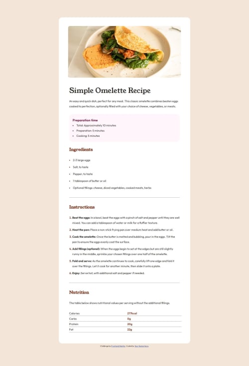
Submitted over 1 year agoA solution to the Recipe page challenge
Clear Code and Responsive Design Using Flex
@gmatt20

Solution retrospective
What are you most proud of, and what would you do differently next time?
I am most proud of coming back since 3 weeks ago of beginning this project (I quit because I got frustrated lol) and I managed to complete it! During the 3 weeks, I learned more about HTML, CSS, and a little bit of JS.
What challenges did you encounter, and how did you overcome them?I could not get the alignment right, so I quitted 3 weeks ago. But I used the 3 weeks to learn deeper about HTML and CSS and I came back with the project completed.
What specific areas of your project would you like help with?None at the moment. The table threw me off which I need more practice in.
Code
Loading...
Please log in to post a comment
Log in with GitHubCommunity feedback
No feedback yet. Be the first to give feedback on Matthew's solution.
Join our Discord community
Join thousands of Frontend Mentor community members taking the challenges, sharing resources, helping each other, and chatting about all things front-end!
Join our Discord