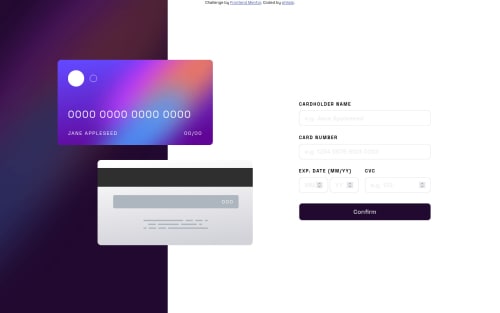
Credit card form with pure CSS, HTML, JS

Solution retrospective
Hello, this is the first challenge I completed here. I would be happy about some feedback!
The most difficult part of creating the website was the validation, because on my first try, the special input system for the expire date (2 inputs) did not work out, because there should be only one message for both inputs. I created a own class for the input validation and managed to implement that behaviour. I did not manage to show the light shade next to the card, because it would then also be displayed on the background image. Does someone know how to do it?
What do you think about my solution, how can I improve?
Please log in to post a comment
Log in with GitHubCommunity feedback
No feedback yet. Be the first to give feedback on philale's solution.
Join our Discord community
Join thousands of Frontend Mentor community members taking the challenges, sharing resources, helping each other, and chatting about all things front-end!
Join our Discord