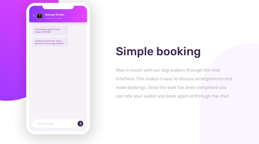
Design comparison
SolutionDesign
Solution retrospective
I feel like I was able to match the design pretty closely, but is there anything I may have missed? What do you think about the structure of my code? Is it easy to read and follow? Anything you would have done differently structure wise? I don't have a lot of experience with css animation, but I'm pretty content with how it turned out. Any suggestions on the animation in particular? Thanks in advance.
Community feedback
Please log in to post a comment
Log in with GitHubJoin our Discord community
Join thousands of Frontend Mentor community members taking the challenges, sharing resources, helping each other, and chatting about all things front-end!
Join our Discord
