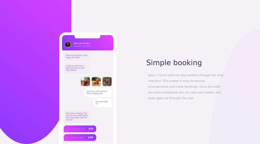
Design comparison
Solution retrospective
after spending a couple of days trying to style the body with background property. I finally figured I was styling it in the wrong way I think, so I created a div with an empty element for the background to make it work, I don't know if this is the best practice, I used HTML & CSS for the project, would have loved to use sass but I am still a beginner.
any thought on how I can improve better on my code. pls would love to hear it. thank you
Community feedback
- @DrKlonkPosted over 3 years ago
Hi AbdulKareem,
I would also check out the accessibility issues in the generated report. Those are quite relevant.
Design wise, the biggest thing for me would be the font and the way the text is styled. Check out here how to add a font to your page.
The padding on the paragraph makes it off line with the heading, which looks strange. I'd just remove the padding.
Also, your background is a bit darker than the design, making for less contrast on the paragraph, which makes it a bit more difficult to read.
In the code you use px and em for sizes a lot, I think it's well worth looking into using rems for all your sizes. It allows you to resize basically your entire site by setting the font-size in a media query. Check out this article on px vs rem, or do some googling on it.
Cheers, Joran
0@seniorteckPosted over 3 years ago@DrKlonk thanks so much, I will definitely, check out the rem, thanks so much for sharing the link, it a very a great resources
0 - @ApplePieGiraffePosted over 3 years ago
Greetings, AbdulKareem! π
Good effort on this challenge! π Your CSS illustration looks pretty nice! π
I'd like to suggest adding a max-width to the main container or wrapper of the page to prevent the content of the page from becoming too wide when the width of the screen increases in the desktop layout.
As for the background shapes in this challenge, I think an easy way to add and position them would be to use pseudo-elements on the
body
. You could give each of the background shapes an explicit width and height and absolutely position them relative to the body of the page. Just remember to setoverflow: hidden
to the body then to avoid any overflow issues. πKeep coding (and happy coding, too)! π
0@seniorteckPosted over 3 years ago@ApplePieGiraffe thanks alot, pls what do mean by the explicit width and height
1@ApplePieGiraffePosted over 3 years ago@seniorteck
Oh by that I just mean a fixed width and heightβnot a width or height dependent on the viewport or something. By setting a fixed width and/or height to the background shapes, the size and shape of the background shapes will be more consistent across screen sizes. π
0@seniorteckPosted over 3 years ago@ApplePieGiraffe okay the fixed width will be max-width & max-height instead of ordinary width and height is this what you mean
0@ApplePieGiraffePosted over 3 years ago@seniorteck
Mm... what I mean is that you should set the width and height of the background shapes in units like px or rem (which are fixed) and not things like percentages or viewport units (which vary quite a bit), since that might cause the shape of the background shapes to become skewed at certain screen sizes. π
0@seniorteckPosted over 3 years ago@ApplePieGiraffe okay thanks, I understand now fully what you meant.. thanks a lot for your help, it has really helped me alot
0 - @pikapikamartPosted over 3 years ago
Great work on your css you got there. Though some little small things is not present like the arrow-left button and the 3 little smalls dots but is fine for now.
Regarding your queries. Okay practices.
- In this challenge, well there is the upper and bottom background parts right, so as we noticed they are not really a important component in here, so creating div elements for them seems unnecessary, what we could do is that use the body tag psudo elements
body::before
andbody::after
. We could just use them instead of creating divs right for the background. Using these pseudo elements really helps us to avoid unwanted elements in the structure, like again for example. The top part of the mobile, the cut out, the color white. Instead of creating a div for that, we just use again the::after
of the.mobile-wrap
selector. So when creating things, look for a way to minimize your html. - Foreground. As I noticed, your mobile seems not popping out like it should do, since the background-color of the mobile is white. So adding those
box-shadows
really helps the user eye to identifies boundaries of different components.
But as you code further, you will get better and better as long as you think first about the layout. List the components which you think have the same styling as other components, so that in your css, you could reuse such selector for different elements. By the way, learning sass is simple, it's like you're just writing css, and it really is, you're just writing css with the addition of preprocessed outputs.
Good work and good luck for further coding^^
0@seniorteckPosted over 3 years ago@pikamart thanks a lot, this is the first time am hearing about the pseudo-element:: before and :: after, please do you know any great resources that can help in learning fully about it and also one I could learn about sass
0@pikapikamartPosted over 3 years ago@seniorteck Well I haven't have that one resource in learning, I just google them, we all do. But if a reference for pseudo elements, well here is a link from w3schools. With pseudo elements, it can really help you minimize other things. For the sass, hmmm, well I think their site will be the best since they are sass so here it is, sass. Just go to the left side, in the content and choose what you want to learn. But keep in mind that you use something like live sass compiler plug-in in vs code. Or for me personally, I use gulp preprocessor for sass, but you have to install node.js first for those.
0 - In this challenge, well there is the upper and bottom background parts right, so as we noticed they are not really a important component in here, so creating div elements for them seems unnecessary, what we could do is that use the body tag psudo elements
Please log in to post a comment
Log in with GitHubJoin our Discord community
Join thousands of Frontend Mentor community members taking the challenges, sharing resources, helping each other, and chatting about all things front-end!
Join our Discord