Not Found
Not Found
Not Found
Not Found
Not Found
Not Found
Not Found
Not Found
Not Found
Not Found
Not Found
Not Found
Not Found
Not Found
Not Found
Not Found
Not Found
Not Found
Not Found
Not Found

Submitted

ChatApp CSS Illustration (Vanilla CSS)

Lucas ๐Ÿ‘พโ€ข 104,440

@correlucas

Desktop design screenshot for the Chat app CSS illustration coding challenge

This is a solution for...

  • HTML
  • CSS
3intermediate
View challenge

Design comparison


SolutionDesign

Solution retrospective
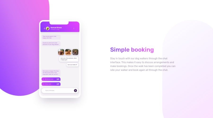

๐Ÿ‘พ Hello, Frontend Mentor coding community. This is my solution for the ChatApp CSS Illustration.

This challenge was really challenging! The hardest thing was the background svg images, I tried to create these gradient elements inside the css with content: ' ' and after/before but for a reason that I don't know a huge gap was created in the bottom. So I took the shortcut to finish the solution and I've exported the svg elements from Figma โค and placed it in the body as background-image. Then I add some animations and changed a bit the design.

๐ŸšFollow me in my journey to finish all HTML/CSS only challenges (Only 4 missing)! Gotta Catch โ€™Em All

Ill be happy to hear any feedback and advice!

Community feedback

Adrianoโ€ข 34,090

@AdrianoEscarabote

Posted

fala lucas, tudo bom?

Cara fiquei pensando aqui e talvez poderiamos resolver o problema com o pseudo elemento no body, usando um overflow-hidden para esconder o corpo da imagem a partir do momento que ela ultrapasse o tamanho do body! seria interessante testar, claro que usariamos um position: relative; no body, e nos pseudos elementos absolute!

espero ter contribuido para uma possivel soluรงรฃo!... ๐Ÿ‘

Marked as helpful

1

Lucas ๐Ÿ‘พโ€ข 104,440

@correlucas

Posted

@AdrianoEscarabote Vou olhar aqui, valeu

0

@chukwudobe-Micah

Posted

Hey Lucas, is the arrow in the text area a button or it's just an SVG? I made mine a button. And also I'll appreciate if you can check my solution too and give a review, I'll appreciate it.

Marked as helpful

1

Lucas ๐Ÿ‘พโ€ข 104,440

@correlucas

Posted

@chukwudobe-Micah Its just a SVG image because I did only for design purposes, but I guess is more practical and correct as a button as you did it. I'll do it my friend. Keep it up =)

0
ThaBeanBoyโ€ข 230

@ThaBeanBoy

Posted

Man, the background feels so alive, & the way the elements are loaded on the screen. This was really impressive in my opinion. hope you don't mind me digging through the code.

I'm curious what the '@media (prefers-reduced-motion:reduce)' does. I've seen this in a couple of places but I'm not really sure what it does. Thanks for any explanation from anyone.

I know this might be a rookie question, is the minified CSS file supposed to improve the loading speed of the site? How would I minify my own files?

All in all, this is a really beautiful site.

Marked as helpful

1

Lucas ๐Ÿ‘พโ€ข 104,440

@correlucas

Posted

@ThaBeanBoy Hey brother, thank you for the time spent writing this comment. The reduced motion is a media query that doesn't display motion/animation when set this on the browser, if you want you can copy my css reset that I took from Kevin Powell. To minify your code you can install the plugin in vscode and this will generate a copy with the code reduced and with a reduced file size or use an online tool to reduce the code, if write on google minifycss youโ€™ll find a bunch in the results.

Keep it up =)

2
HinaSejaru124โ€ข 310

@HinaSejaru124

Posted

Actually, the 2 background objects don't fit well for large screens. In your CSS positioning, instead of using a fixed distance, I propose you to fix the distances according to percentages so as to make it a relatively absolute position according to big PC screens

Marked as helpful

1

HinaSejaru124โ€ข 310

@HinaSejaru124

Posted

And equally the ID's are to be used uniquely for each element.But anyway good job

Marked as helpful

0
Lucas ๐Ÿ‘พโ€ข 104,440

@correlucas

Posted

@HinaSejaru124 Thank you! I'll fix that soon, I didn't paid attention for the id issue, you're right.

0
HinaSejaru124โ€ข 310

@HinaSejaru124

Posted

@correlucas when seen on a phone the phone itself seems a little bit distorted e.g the speaker is left aligned the messages overflow I think for that you needed to define a fixed width for such elements so that it should be more ... Anyway I saw the improvements ... Passed from superb to exceptional

Marked as helpful

0
Joshโ€ข 560

@jkellerman

Posted

One of the best ones i've seen, well done!

1

Lucas ๐Ÿ‘พโ€ข 104,440

@correlucas

Posted

@jkellerman thank you Josh

0

Please log in to post a comment

Log in with GitHub
Discord logo

Join our Discord community

Join thousands of Frontend Mentor community members taking the challenges, sharing resources, helping each other, and chatting about all things front-end!

Join our Discord