Design comparison
SolutionDesign
Community feedback
- @ramsaysewellPosted over 4 years ago
Hey Jonathan,
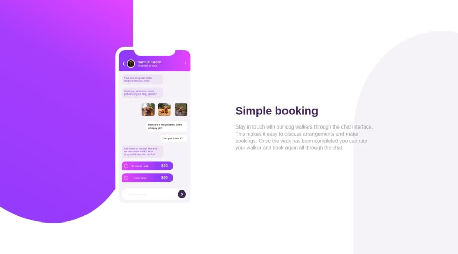
This looks really cool, well done on working with the pretty complex CSS, you've done a great job.
I think the iPhone itself could stand out a bit more with a
box-shadowlike shown in the design.Maybe something like
box-shadow: 4px 3px 30px rgba(0,0,0,0.1);?Looks great, keep it up!
Ramsay
2
Please log in to post a comment
Log in with GitHubJoin our Discord community
Join thousands of Frontend Mentor community members taking the challenges, sharing resources, helping each other, and chatting about all things front-end!
Join our Discord
